Simple & Trusted .
The PDP is where Sky Mobile either earns confidence or loses it. I led the redesign of the Product Detail Page to solve a structural problem in the purchase journey: customers could configure a device before fully understanding the real package cost, which created confusion, extra steps and avoidable drop-off.
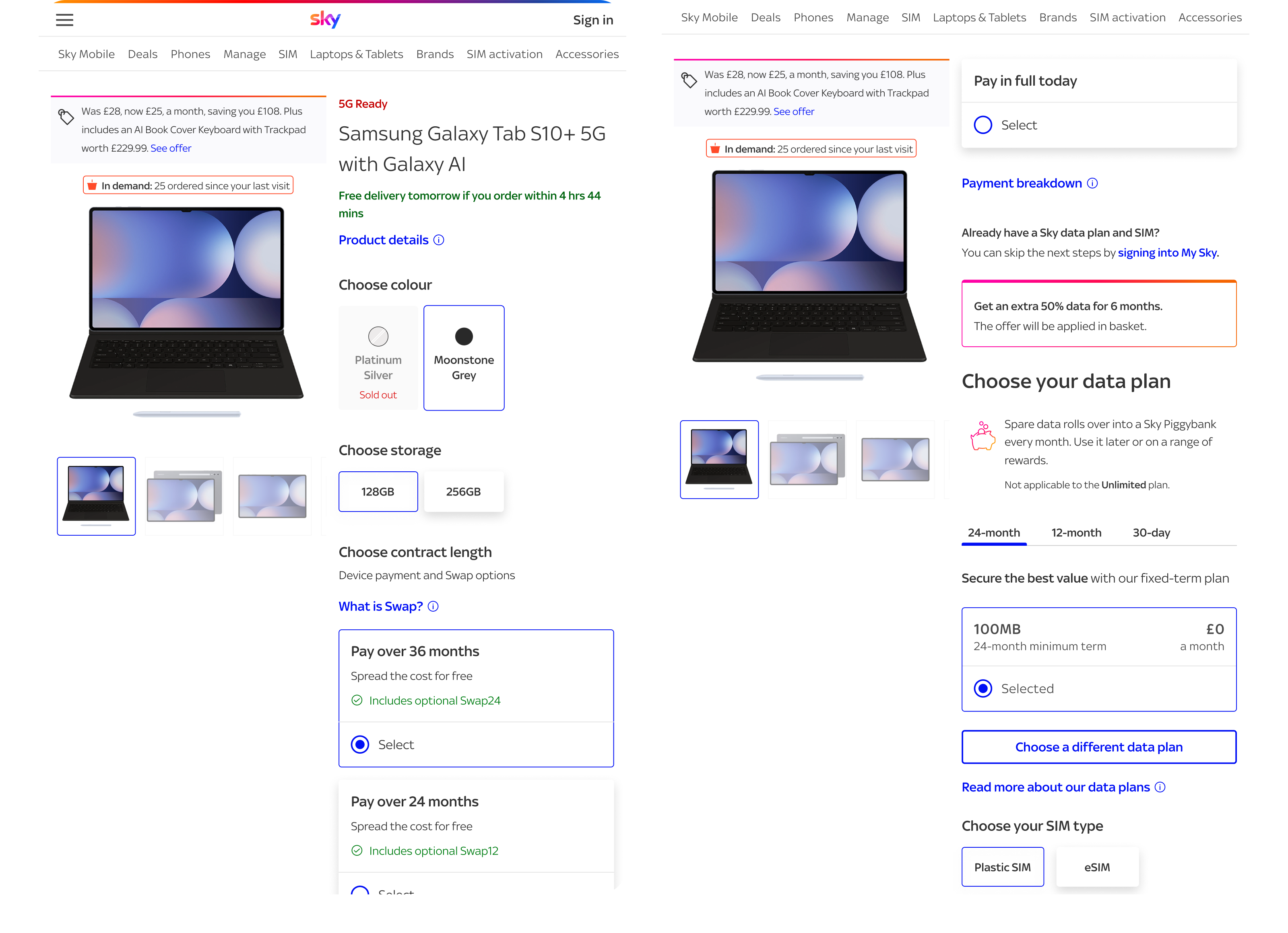
The redesign brings device, contract and data into one place so the proposition feels clearer, more transparent and easier to buy.
The problem .
The legacy PDP was not failing because it looked dated. It was failing because one of the most important decisions in the journey had been split across too many steps.
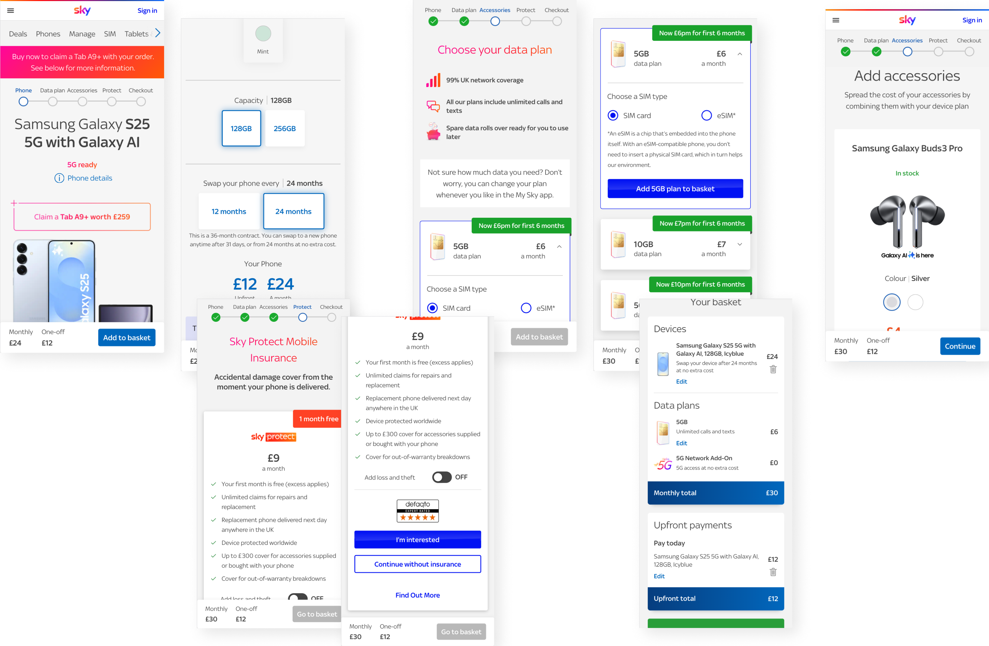
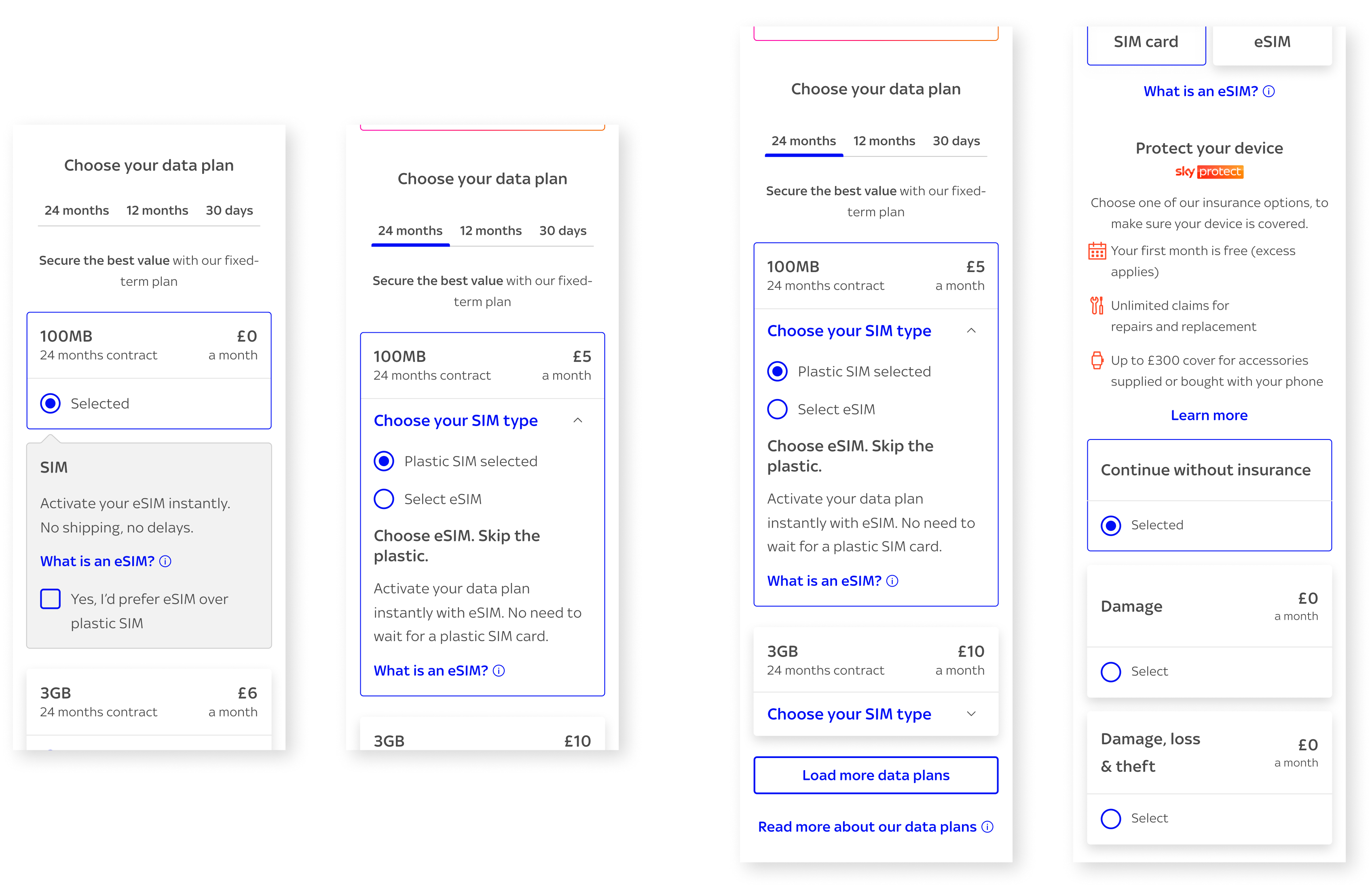
Customers began by choosing a device and contract, but the data plan sat later in the flow. That meant the initial monthly price did not represent the full package. Users had to continue, discover that data was still missing and then mentally recalculate value. At a key moment in the journey, the experience was asking people to work too hard.
That kind of friction matters. When customers feel they are seeing only part of the cost, confidence drops. What should feel like a clear purchase decision instead becomes a stop-start process of checking, comparing and second-guessing.
User needs
- Understand the full monthly cost earlier in the journey
- Compare device, contract and data choices without losing context
- Feel confident that Sky Mobile is being clear about what is included
Business needs
- Reduce avoidable drop-off between PDP and data plan selection
- Create a simpler route to basket across mobile, tablet and desktop
- Establish a scalable model that can launch in Tablets and Laptops first, then extend further
Problem statement
Sky Mobile needs a PDP that presents the full purchase package transparently in one place (price and configuration), rather than across multiple screens.
Defining success early .
Prior to redesigning this page, I wanted to be clear about what “better” actually meant. Without that, it is easy for a PDP redesign to become a visual tidy-up rather than a structural improvement.
For this work, success meant four things happening at once.
What success looks like
- The total monthly cost is visible as customers make decisions
- Device, contract and data feel like one coherent configuration flow
- The page reduces cognitive load across breakpoints
- The model creates a strong foundation for future add-ons such as Sky Protect
These principles helped keep the work focused. They also made it easier to align product, engineering and commercial stakeholders around the same outcome.
The research .
Discovery
I mapped the existing journey end to end and focused on where confidence was being lost. The issue was not simply that the flow had too many steps. The deeper problem was that users had to hold partial information in their head and piece the proposition together themselves.
The more I looked at the journey, the clearer it became that the real problem was structural. Price clarity and choice architecture were fighting each other. Users were being asked to make a product decision before they could properly understand the full cost of ownership.
I used journey analysis, existing insight and stakeholder review to pressure-test the redesign direction. That work helped shift the conversation away from “how do we improve this page?” towards “how do we make the proposition easier to understand and trust?”
User Pain Points
- The initial monthly price felt incomplete
- Data plan selection arrived too late in the journey
- Comparing options required too much memory and backtracking
- Promotional and reassurance messaging risked becoming disconnected from configuration
Acceptance Criteria
- Full package pricing updates live as choices change
- Core decisions sit within one coherent layout
- Important messages remain visible without overwhelming the page
- The interaction model works cleanly across mobile, tablet and desktop
How Might We (HMW)
As a result, I reframed the work through a small set of clear How Might We.
They forced clarity, gave the team something specific to design against and helped align stakeholders around the real challenge.
HMW bring device, contract and data into one decision space without overwhelming the page?
HMW make total cost transparent from the outset rather than later in the flow?
HMW keep the PDP commercially effective whilst making it feel simpler and more trustworthy?
HMW create a foundation that can later support contextual insurance without adding more friction?
Development .
Refinement through iteration
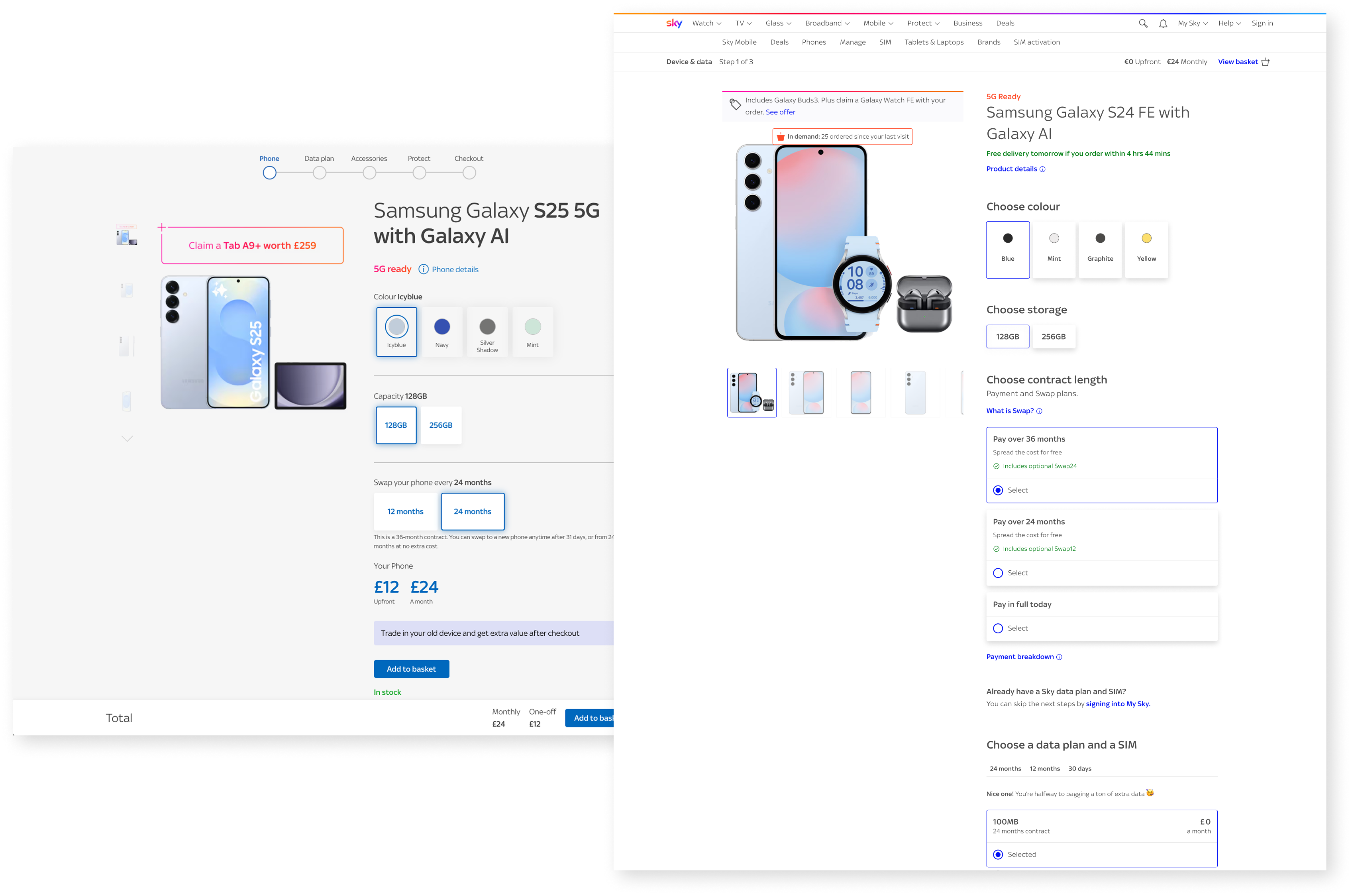
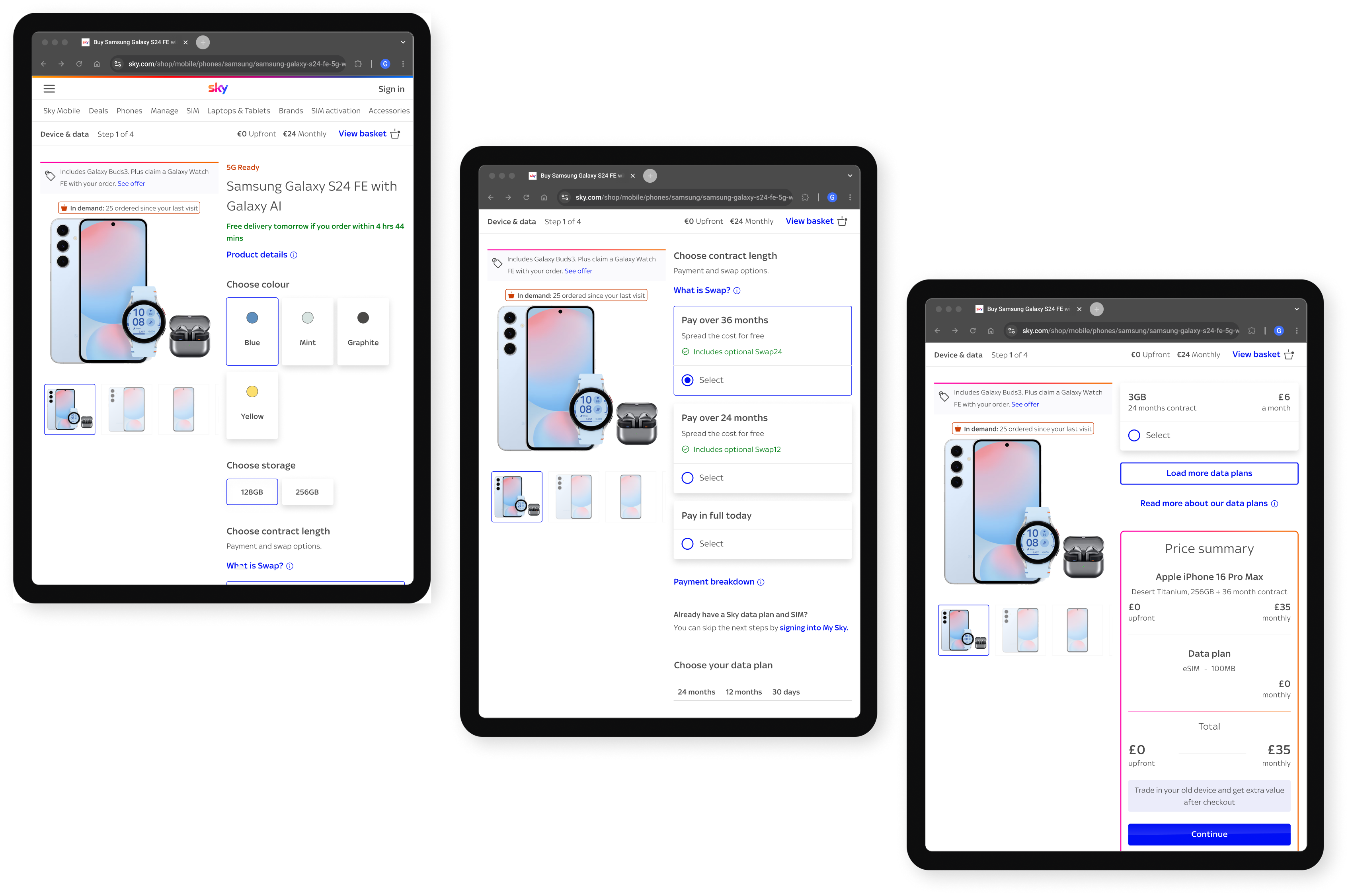
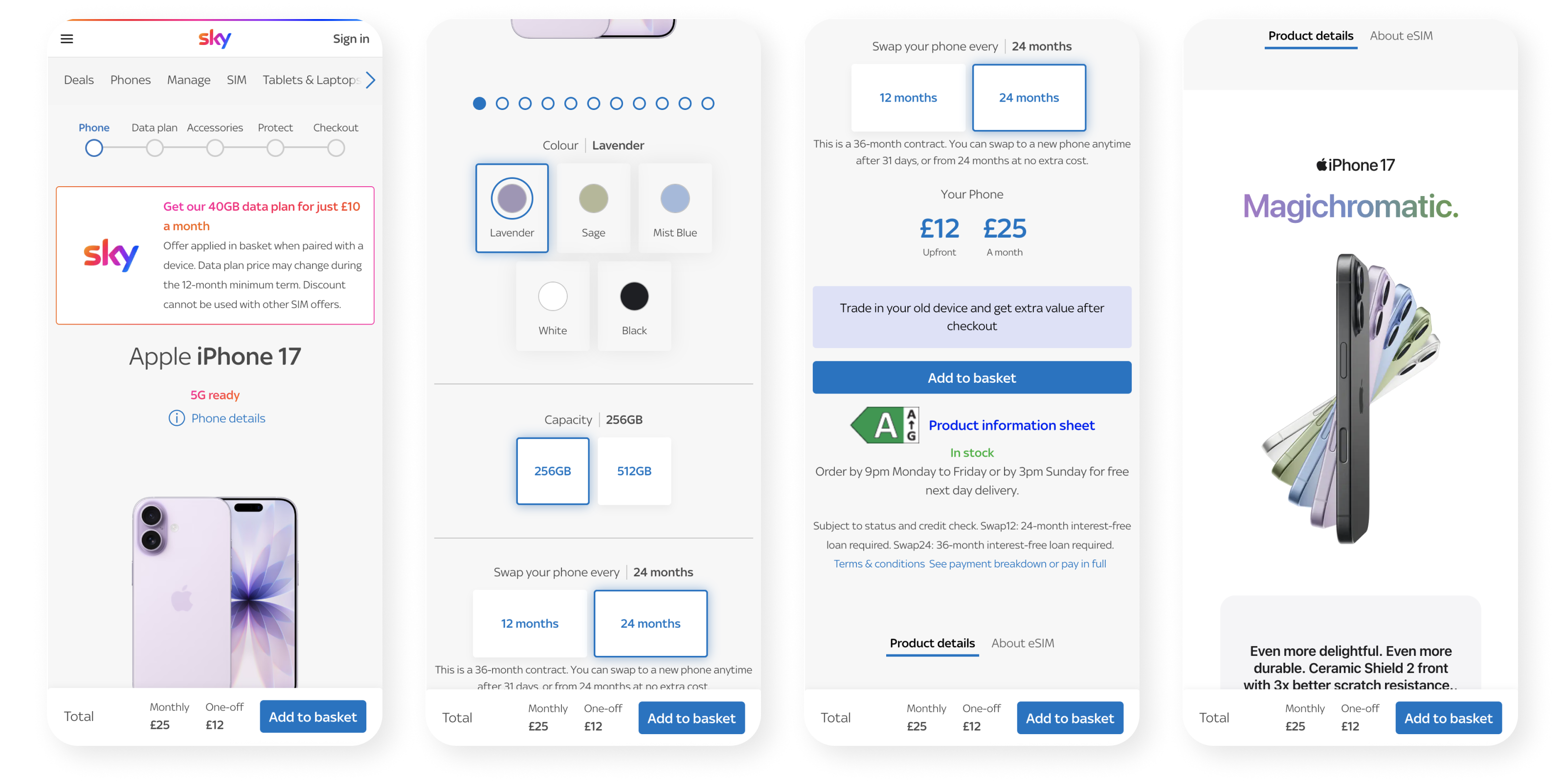
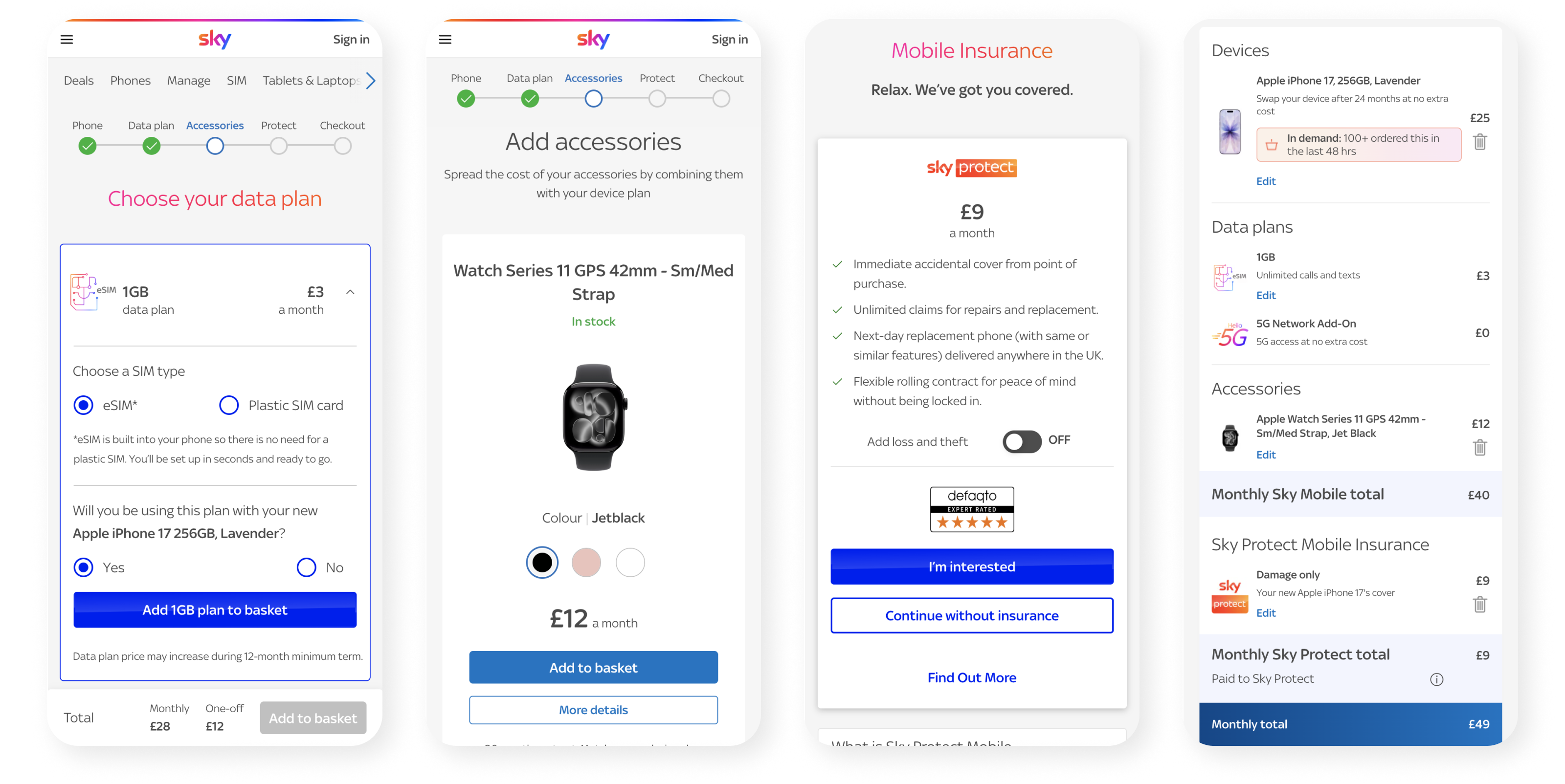
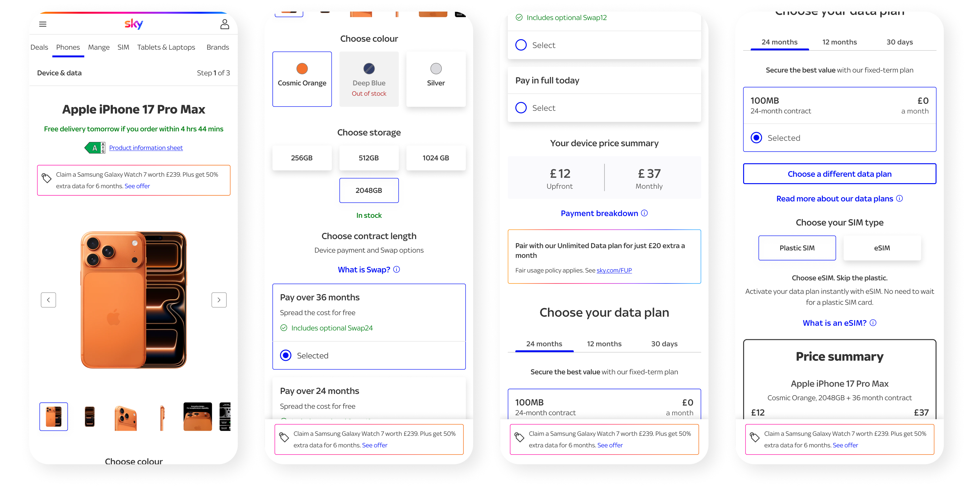
The redesign centred on one fundamental shift: instead of separating device configuration from plan selection, I brought the full package together into a single flow. Device, contract length and data are now configured in one place, with the total package price updating live as selections change.
That sounds straightforward, but it required careful hierarchy work. Surfacing more information earlier can easily make a page feel heavier. So I treated clarity as the core design principle throughout: every component had to earn its place, every label had to reduce ambiguity and every interaction had to help users stay oriented.
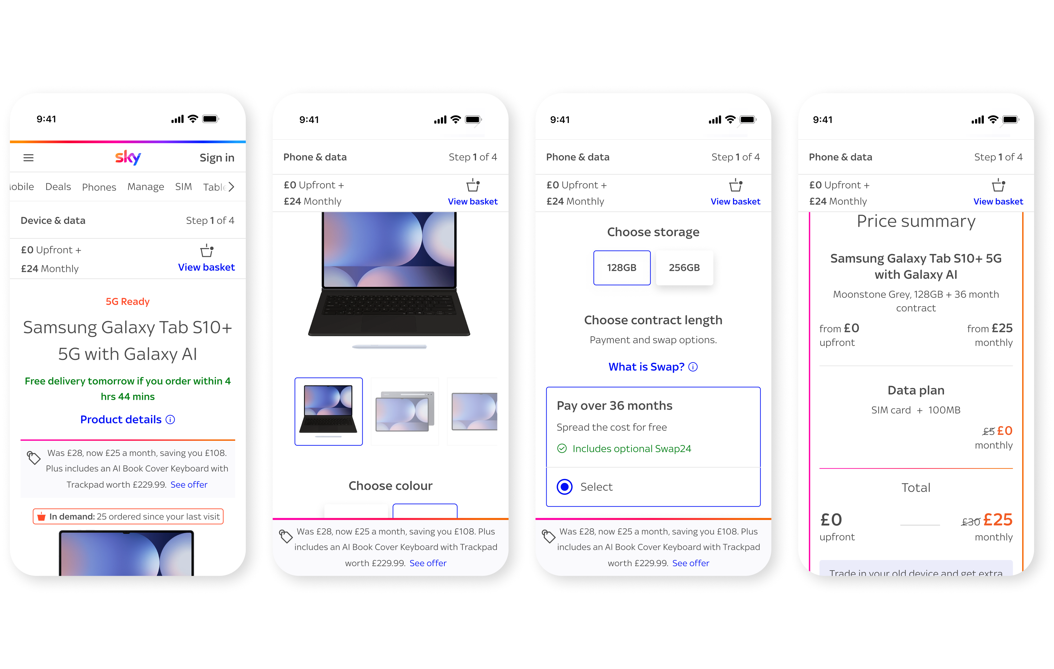
I also refined the sticky behaviour differently by breakpoint. On mobile, promotional detail remains connected to the product as users scroll. On larger breakpoints, the product and promotional area stays visible whilst users review configuration and pricing options. In both cases, the aim was the same: keep people anchored in the offer instead of asking them to mentally reconstruct it.
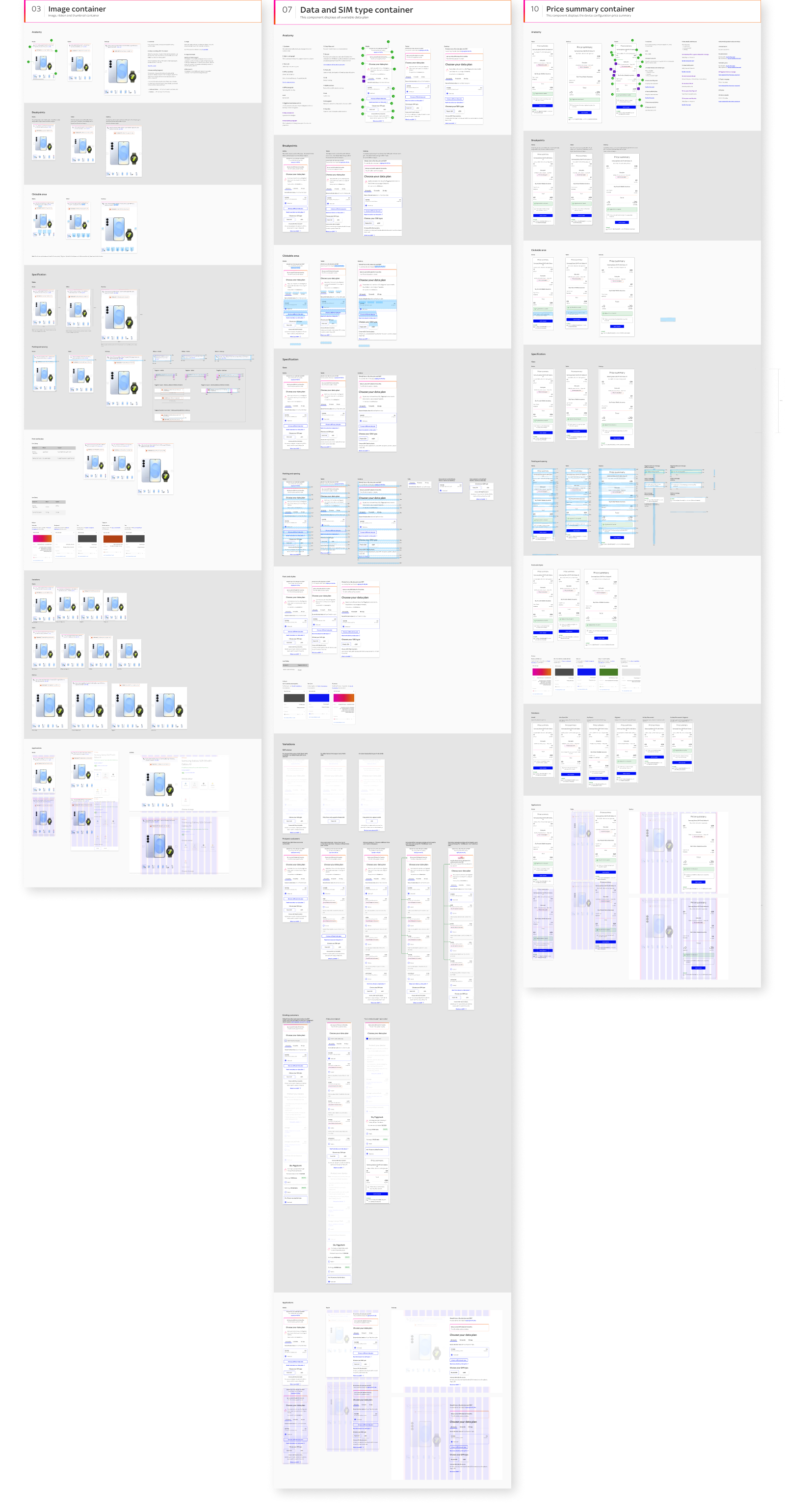
Documentation
I documented the redesigned model so it could scale beyond a one-off page change:
- Configuration logic and hierarchy principles
- Responsive behaviour across breakpoints
- Sticky interaction guidance for promotional content
- A foundation for future Sky Protect integration
Test & validate .
Because the redesigned PDP is still in development, this work is currently more about validating the model than reporting post-launch KPIs.
Testing
- Journey walkthroughs with stakeholders
- Design critiques across the stream
- Prototype reviews across breakpoints
Validating
- Checked whether total cost became clearer earlier in the journey
- Reviewed whether the unified layout reduced back-and-forth decision-making
- Assessed whether the model could launch safely in Tablets and Laptops before broader rollout
Rollout strategy
Rather than release the new PDP everywhere at once, the model is being introduced first within Tablets and Laptops. That lowers delivery risk, creates a more controlled environment to learn from and gives the team a stronger foundation before scaling the pattern further across mobile.
Impact and why it matters .
The most important change here is not visual. It is structural.
The PDP moves from a stepped journey with hidden cost implications to a clearer configuration model where customers can understand the package as they build it. That matters because trust at this stage is fragile. When users feel the real cost appears too late, confidence drops. By bringing the proposition together earlier, the new PDP is designed to reduce that uncertainty and make the purchase journey feel more honest, more modern and easier to navigate.
What I learned
One of the biggest lessons from this project was that simplification is often structural, not cosmetic. The opportunity was not to polish the old pattern, but to rethink how pricing, choice and reassurance work together on the page.
What's next
The next phase builds on this foundation by introducing Sky Protect at a more relevant moment in the journey. Rather than appearing later as a disconnected add-on, insurance can be surfaced contextually once a device has been selected, with clear options and clear price implications.
We are currently prototyping that iteration to make sure it feels helpful rather than intrusive, and that it follows the same principles as the redesigned PDP: transparency, lower friction and more confident decision-making.


