Clarity that Converts .
I led the redesign of Sky Mobile’s Product Listing Page to fix a structural weakness in the browsing journey: customers were forced through a cluttered, merchandising-led layout before they could properly reach, scan and compare devices. The result was unnecessary friction at a critical point in the path to purchase.
The new PLP puts user intent first — surfacing phones, filters and key product information much earlier so the experience feels simpler, clearer and more trustworthy, without compromising commercial impact.
The problem .
Sky Mobile’s Product Listing Page sits at a crucial point in the discovery and comparison journey for phones, tablets and laptops. It is where customers narrow their options, compare deals and decide whether to keep exploring or move towards purchase. In practice, the page was trying to satisfy too many competing commercial goals at once, and the experience had become cluttered and hard to scan.
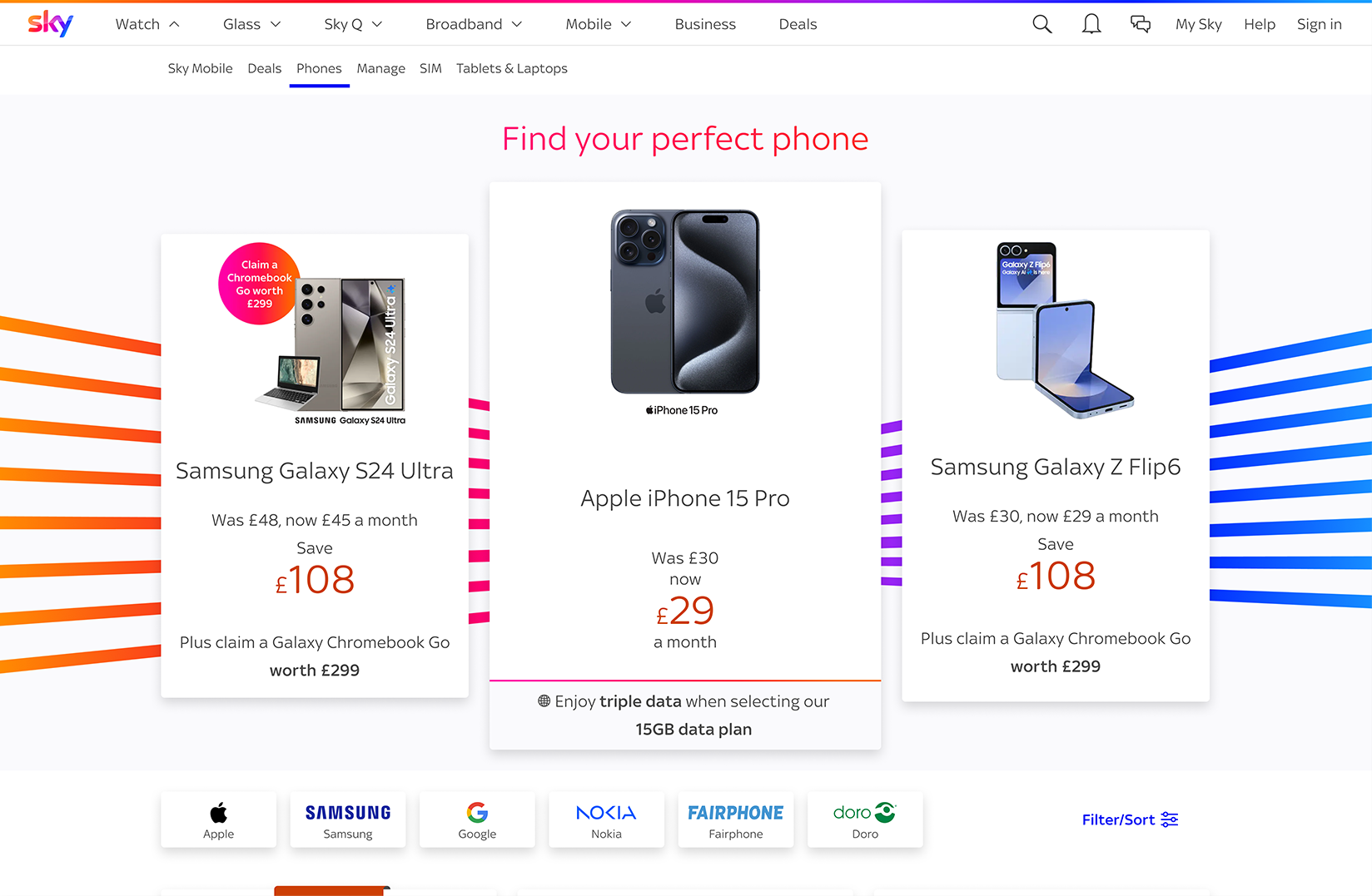
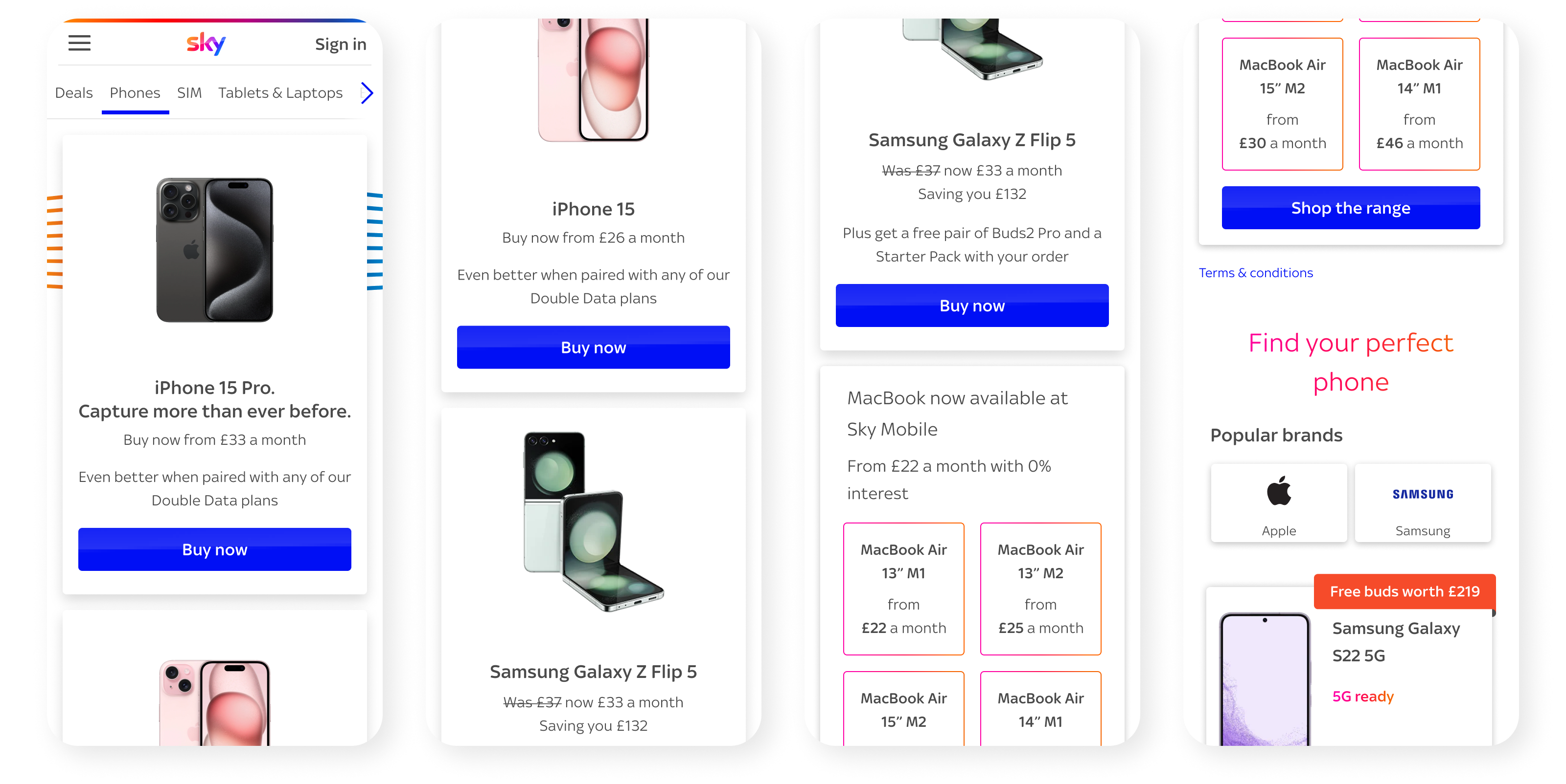
The biggest issue was structural. On mobile, key product cards were pushed well below the fold by stacked merchandising tiles and secondary content. With mobile traffic accounting for the vast majority of visits, this created unnecessary friction at exactly the point where clarity mattered most. Research and testing showed that users were struggling to reach phone listings quickly, spot filters easily and compare products with confidence.
User needs
- Reach phones faster without scrolling through unrelated content first
- Browse a layout that feels simpler, lighter and easier to scan
- Use pricing, imagery, colour options and offer messaging to make faster decisions
Business needs
- Commercial content to support browsing instead of interrupting it
- Create a layout that balances user clarity with business needs
- Build a structure that can scale for future campaigns and trading requirements
Problem statement
Sky Mobile needs a PLP so customers can reach and compare products faster, while preserving the commercial visibility the business depends on.
Defining success early .
From the outset, I set a clear direction for the redesign. The work needed to reduce unnecessary scroll, especially on mobile, make product cards easier to scan, improve filter usability and accessibility, and rebuild the merchandising hierarchy without overwhelming the page. It also had to remain flexible enough to support future trading and promotional requirements.
Success would be measured in two ways: first, through a visibly clearer and more usable experience, and second, through measurable commercial improvement once tested live.
These principles helped keep the work focused. They also made it easier to align product, engineering and commercial stakeholders around the same outcome.
The research .
Discovery
The research highlighted three core issues in the previous experience. First, visibility: stacked merchandising cards and secondary sections delayed access to the main phone listings. Second, discoverability: users were missing filters and essential comparison tools. Third, performance: the cluttered structure was increasing drop-off, particularly during busy commercial moments.
This gave us a clear signal that the page did not need more content or more features. It needed stronger hierarchy, better focus and a more intentional browsing journey.
User Pain Points
- Users had to scroll past stacked merchandising and secondary content before getting to the main phone listings
- FKey decision-making tools lacked visibility, making it harder for users to refine options and compare devices confidently
- Too much competing content reduced clarity, increased cognitive load and made browsing feel heavier than it should
Acceptance Criteria
- The redesigned PLP should reduce friction to the core browsing experience, especially on mobile
- Key actions should be surfaced earlier and presented clearly enough to support confident exploration and comparison
- Merchandising must still deliver business value, but without disrupting the primary browsing journey or increasing drop-off
How Might We (HMW)
As a result, I reframed the work through a small set of clear How Might We.
They forced clarity, gave the team something specific to design against and helped align stakeholders around the real challenge.
HMW help users reach relevant products faster on the PLP?
HMW make filters and comparison tools more visible at the moment users need them?
HMW simplify the browsing journey so users can scan, evaluate and choose with less effort?
HMW balance commercial visibility with a clearer, more user-led product discovery experience?
Development .
I led the redesign through a strategic and multi-disciplinary approach, setting the design vision and principles while guiding the wider team through ambiguity and tight release cycles. The focus was not only on improving the UI, but on reshaping the structure of the page so the experience could work harder across product, content, engineering and commercial needs.
Refinement through iteration
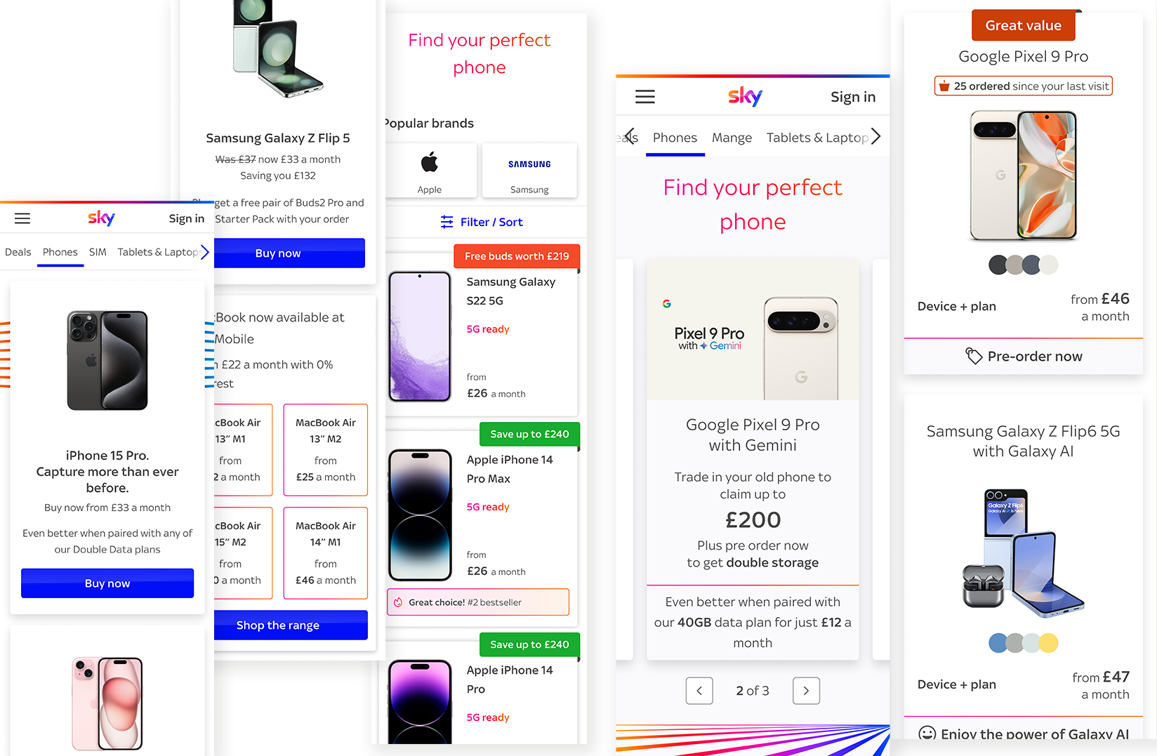
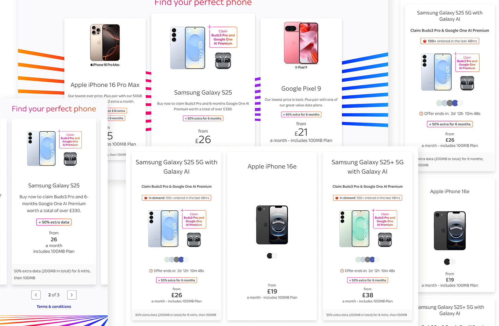
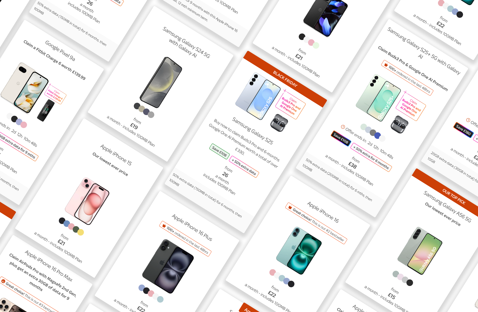
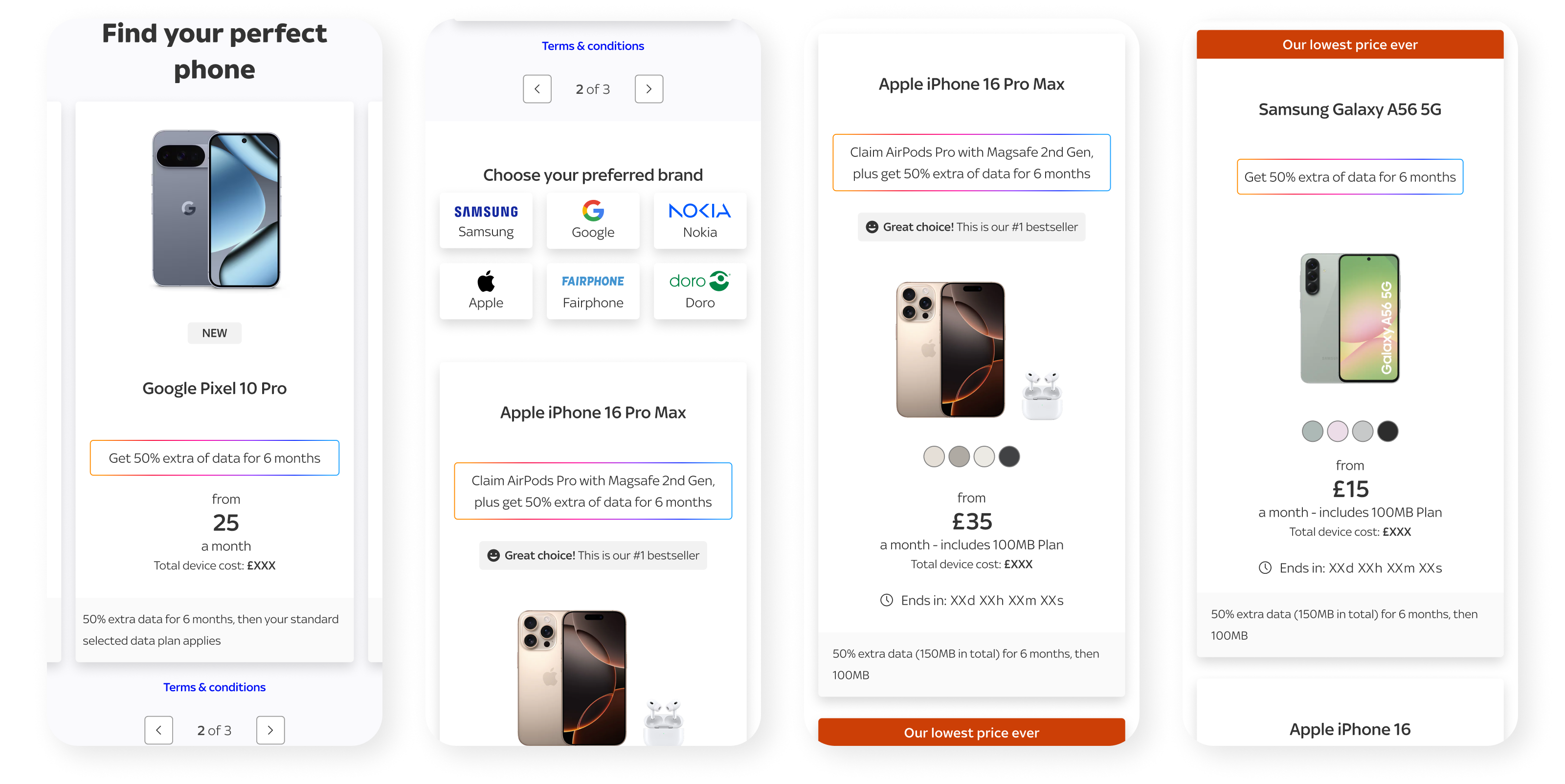
The first major shift was prioritisation. The new layout brings phones, the primary user goal, to the centre of the experience much earlier. Key actions and filters are surfaced sooner, helping reduce cognitive load and making the page feel more immediately useful.
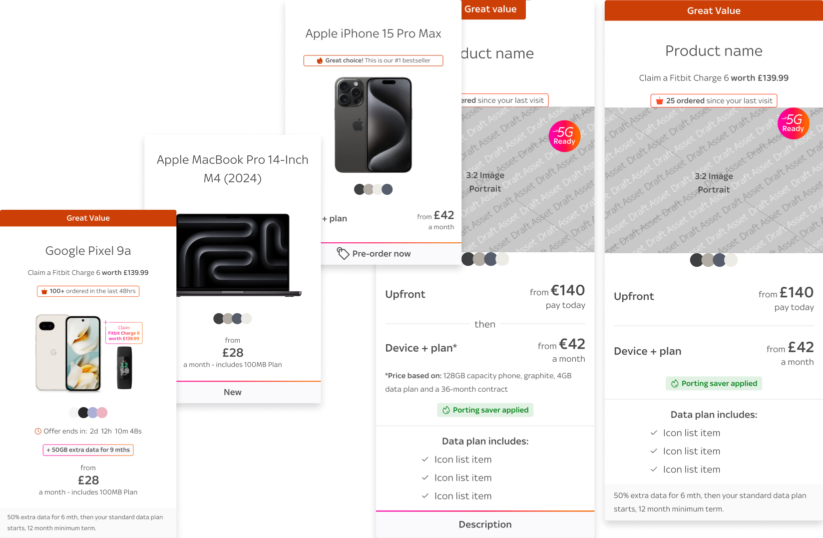
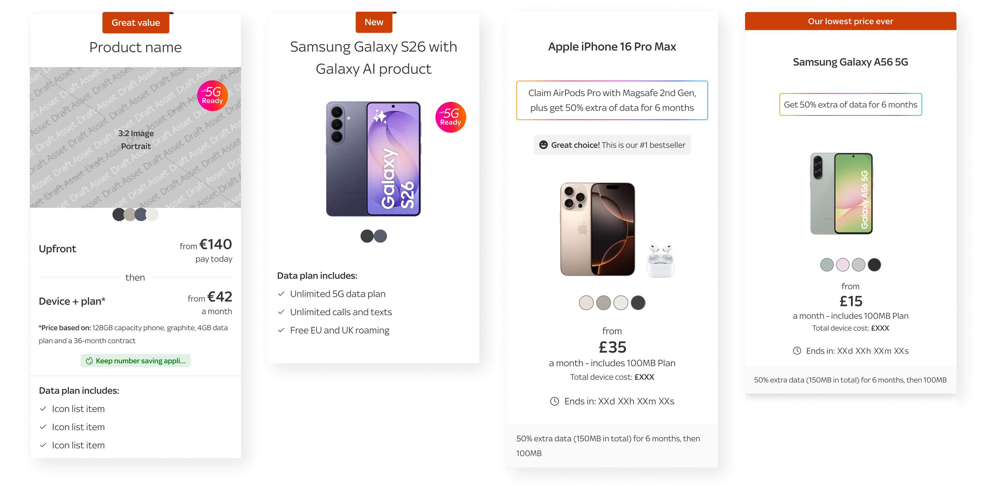
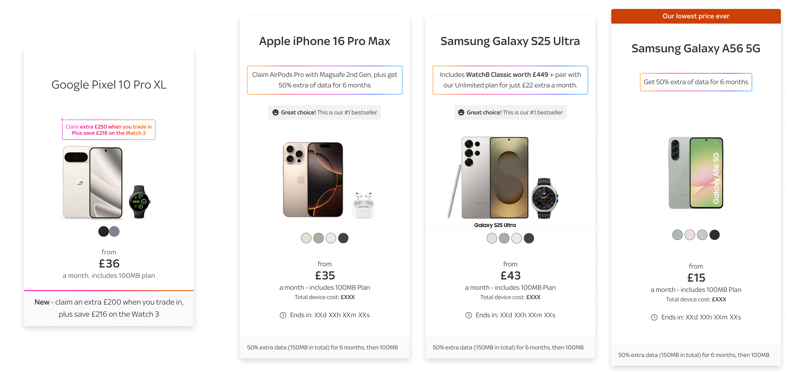
The second shift was the product card itself. Through multiple design sprints and rounds of testing, I developed a cleaner card pattern that balanced clarity with commercial flexibility. The cards introduced stronger product imagery, clearer offer headlines, visible colour swatches, more transparent monthly pricing, structured legal messaging and social proof. Together, these changes made the content easier to scan while also improving emotional engagement and trust.
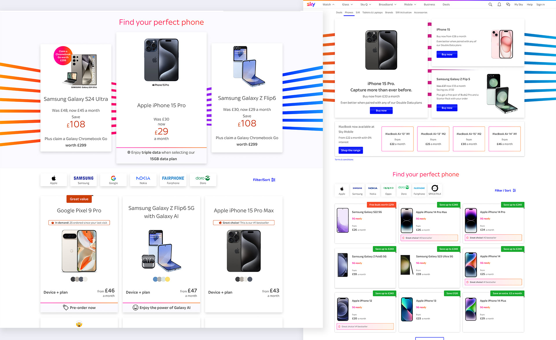
The third shift was the merchandising strategy. Rather than removing merchandising, I restructured it. On larger viewports, the hero area became a balanced inline composition with one dominant central tile and two supporting tiles. On mobile, that same content transformed into a horizontal carousel focused on a single high-impact hero card. This preserved commercial value while giving the product listing more breathing room and reducing the amount of scrolling required before users reached the core content.
Collaboration
This was a highly collaborative piece of work. I worked closely with engineering, analytics, product management and content strategy to align decisions across disciplines. My role extended well beyond interface design: I facilitated workshops, simplified requirements, translated commercial constraints into more user-friendly structures and partnered with engineering to scale emerging patterns into the design system. I also ensured accessibility standards were considered across components and supported junior designers through critique, ideation and delivery.
This is the kind of work I enjoy most: taking a messy, high-stakes problem and creating alignment through clarity, structure and momentum.
Along the way I then tightened interaction detail and accessibility:
Cards became fully clickable for better target size and faster scanning
Built for keyboard navigation and screen reader compatibility
Clean hierarchy that supports quick scanning on mobile
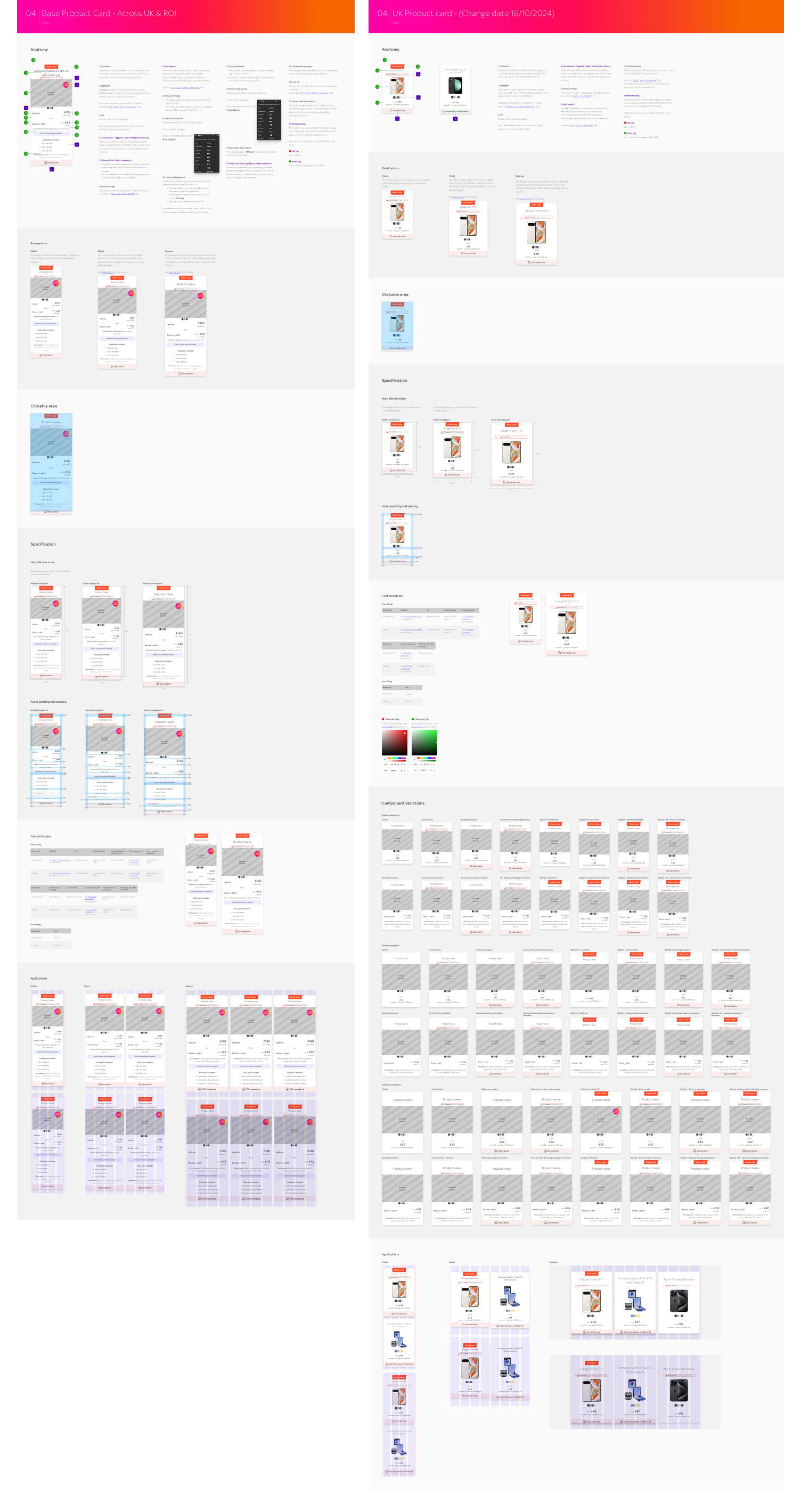
Documentation
I documented the redesigned model so it could scale beyond a one-off page change:
- Configuration logic and hierarchy principles
- Responsive behaviour across breakpoints
- Focus on product imagery and pricing
- Clear offer positioning and visual identity
Test & validate .
The redesign was validated through a 50/50 A/B test run between January and February 2025. The control converted at 5.2%, while the new variant reached 7.51%, resulting in a total uplift of 44.6%. This was strong evidence that a clearer, more user-centred PLP could deliver better commercial outcomes without compromising business requirements.
For me, this was important because it confirmed that the work was not simply a visual improvement. It was a structural improvement to the browsing journey, and users responded to it immediately.
Impact and why it matters .
This project demonstrates how I lead product design: by combining strategic thinking, craft and collaboration to solve complex problems in a practical way. The final PLP experience became simpler, more accessible, more transparent and measurably more effective. The project also created a stronger foundation for future iteration, including more targeted marketing placements, contextual data offers, performance improvements for peak traffic and continued refinement of hierarchy based on analytics and testing.
It also reflects something I care about deeply in leadership roles: helping other designers grow while delivering better work. Alongside the redesign itself, I invested in mentoring junior designers so they could build confidence in their rationale, decision-making and ownership of deliverables.
What I learned
This project showed that better structure can drive more impact than adding more features. By improving hierarchy, focus and visibility, I helped turn a cluttered experience into one that felt clearer, faster and more effective for users and the business.
What's next
The new PLP creates a stronger base for continued optimisation. Future work can build on this by refining merchandising, improving comparison journeys and using analytics to keep strengthening performance over time.
Results
5.2%
7.51%
44.6%


