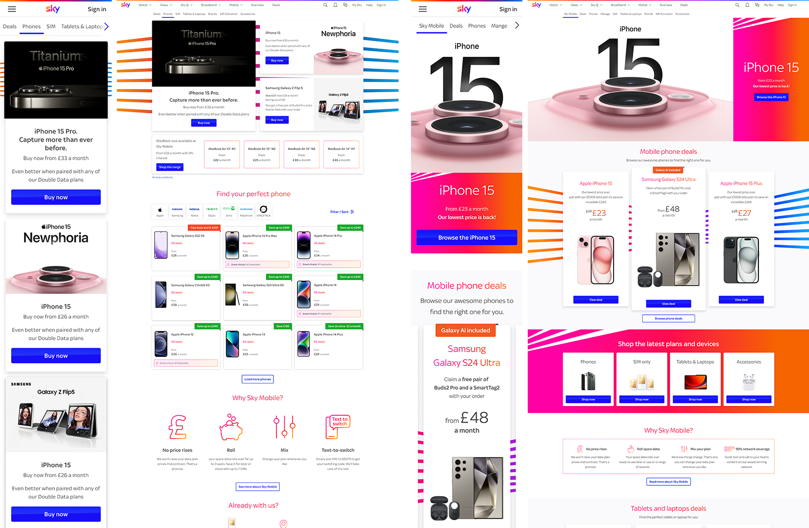
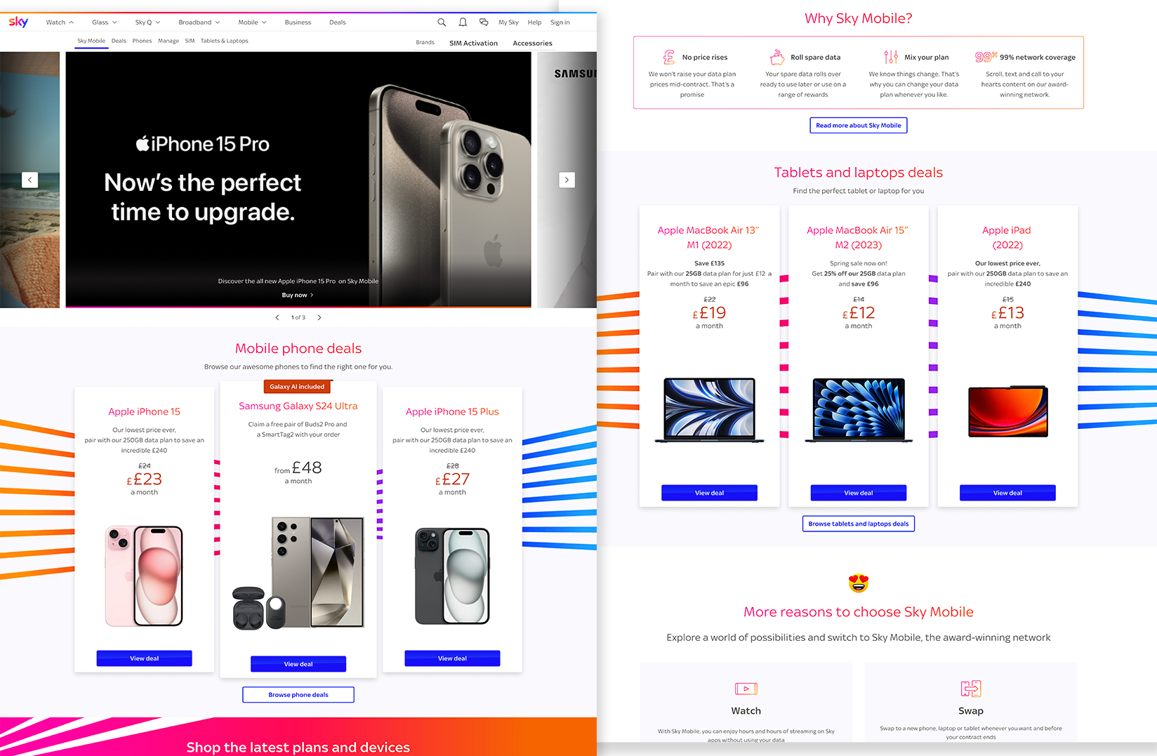
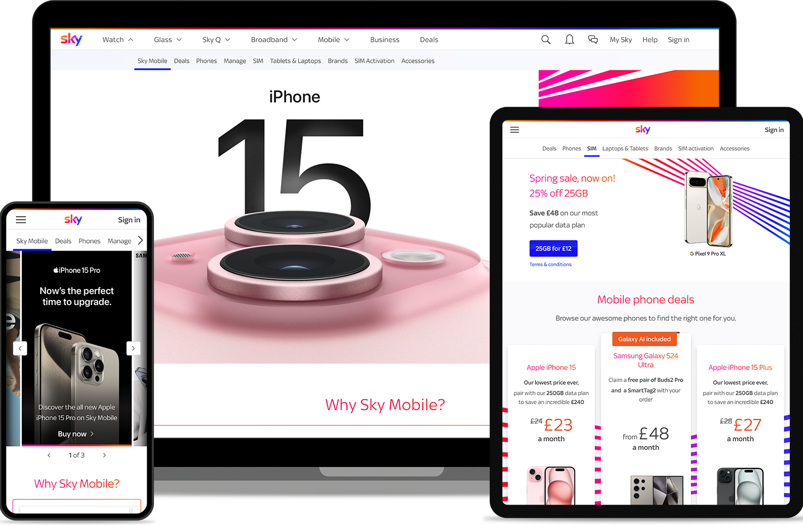
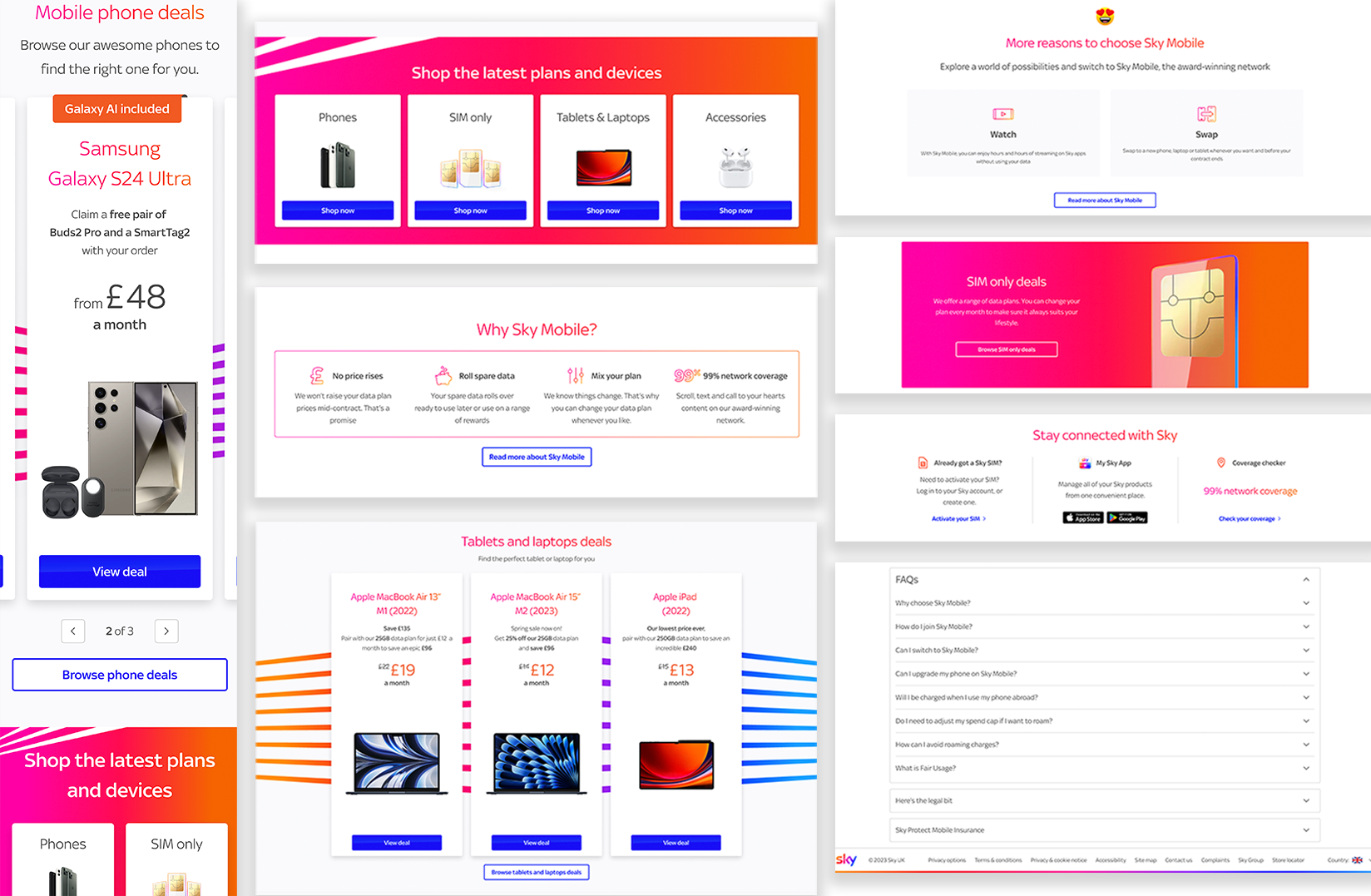
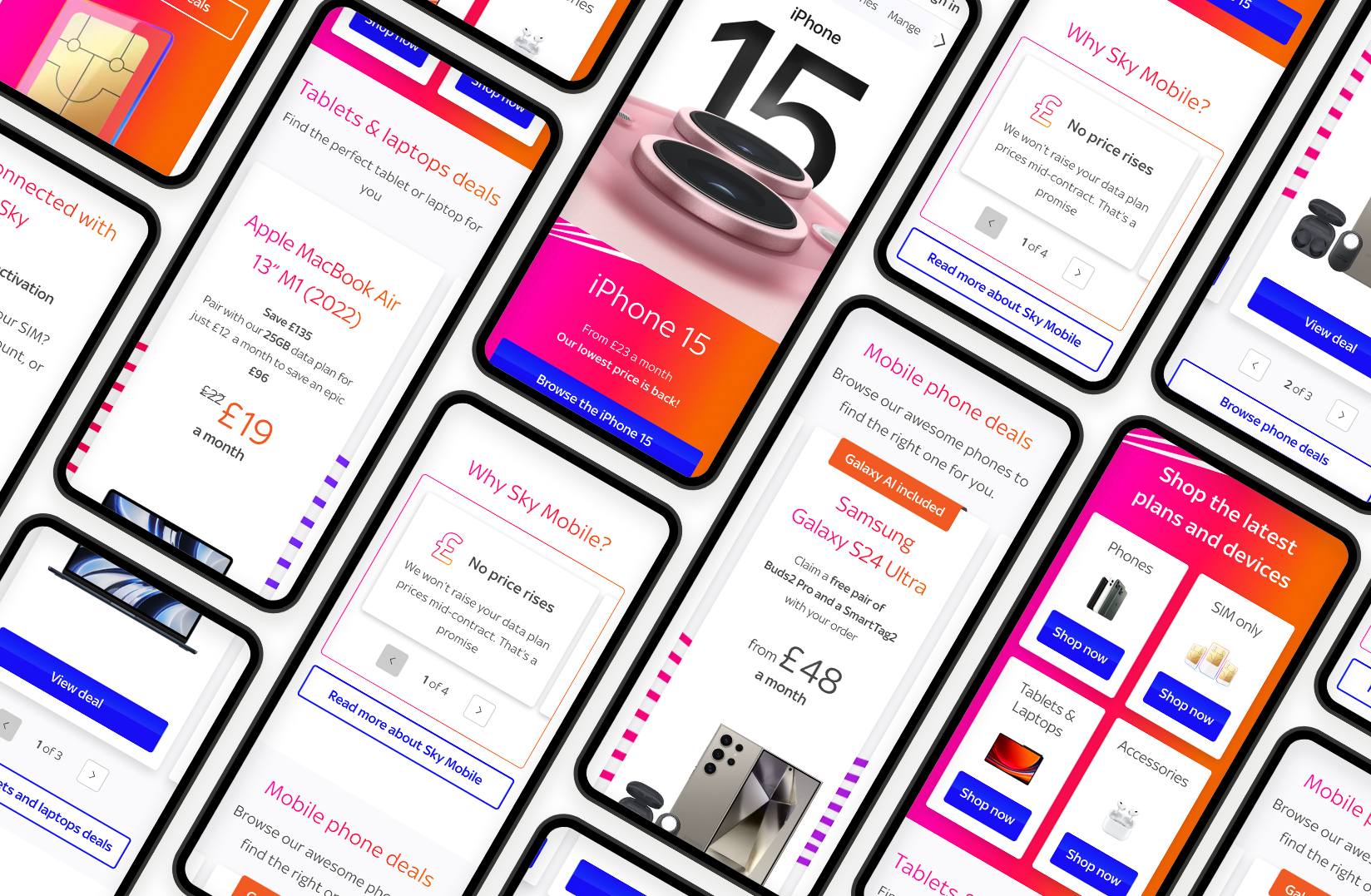
Sky Mobile's store front .
In February 2024 I ran a full end-to-end journey playback for stakeholders that made one thing painfully clear: users could not understand the total package cost (device + data + contract), so they compensated by going in circles between the PLP, the PDP and the data plan page.
One participant summed up the feeling bluntly: “It’s a pretty website, but a lot of it is hidden.”
So the homepage became the first “orientation moment” in the journey: a place to build credibility, make Sky Mobile feel like a premium choice and help customers choose a direction without getting lost.
The problem .
Sky Mobile did not have a true storefront, its homepage was the phones PLP, which created three problems:
- No clear entry point: customers arrived in the middle of the journey, without context
- Low confidence for prospects: research showed limited awareness of Sky Mobile and some people comparing it to lower-trust brands
- Early confusion compounds later confusion: if you start disoriented, the pricing and contract complexity later (PLP, PDP and data plans) feels even harder
The homepage redesign created a clear entry point to build trust, improve discoverability of Sky Mobile’s offering and to give users a confident shopping experience.
User needs
- Low awareness and weaker credibility signals for prospects
- Early confusion about what Sky Mobile offers and where to start
- Over-reliance on deal-led entry points that could feel irrelevant or unclear
Business needs
- Missed opportunity to merchandise multiple categories
- Limited ability to flex messaging for seasonal launches or brand trading
- Higher early drop-off, especially on mobile
Problem statement
Sky Mobile lacks a single entry point that builds trust and routes customers into a clear shopping direction.
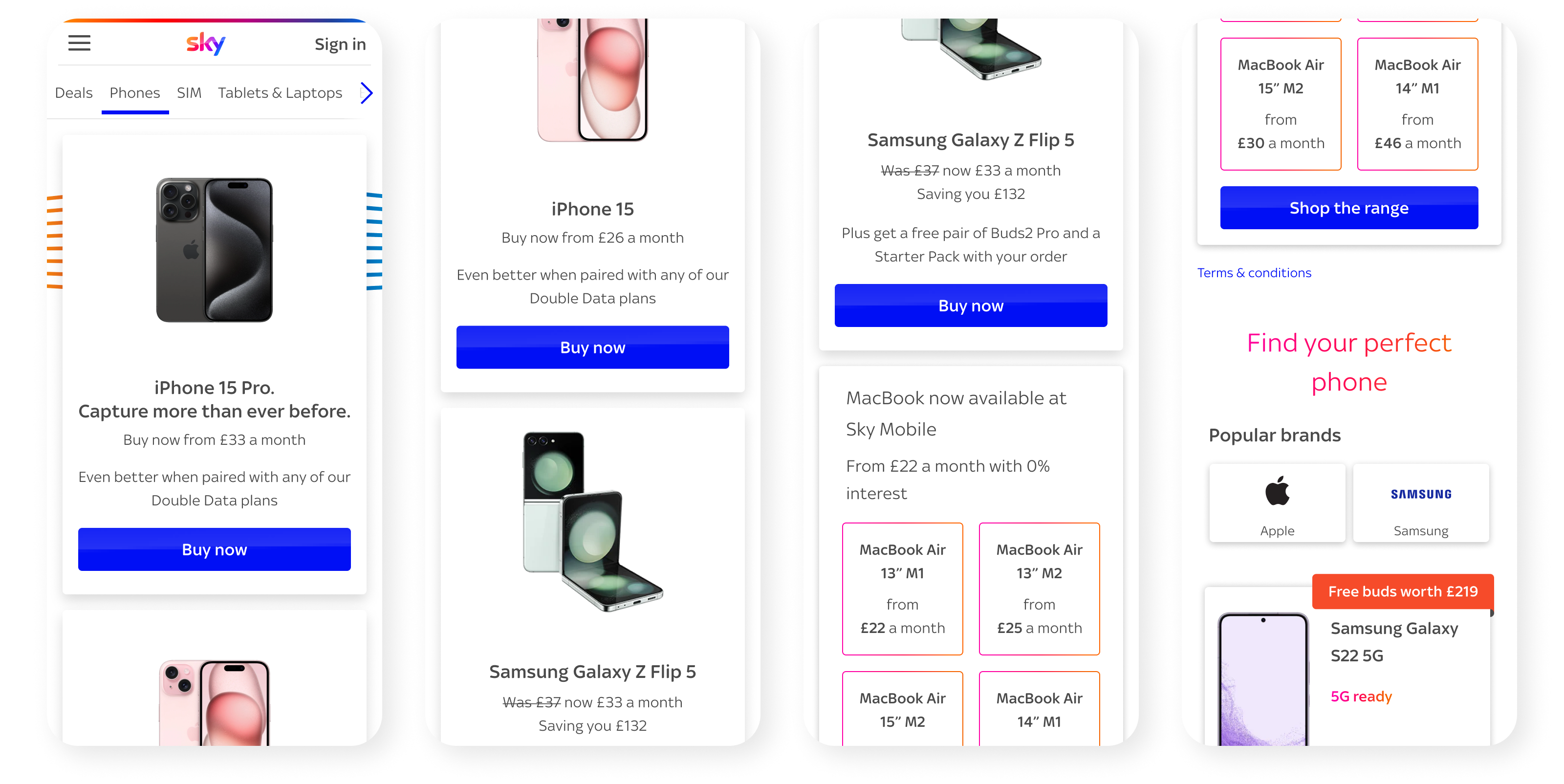
The research .
Discovery
I started with a competitor analysis and prepared a journey playback from initial research which surfaced early-stage issues that a homepage could directly influence:
- Awareness and credibility: “I don’t really see them as being premium, a bit like Tesco mobile”
- Reassurance needs: users looked for unique selling points, proof and clarity before committing
- Deal messaging risk: some deals felt irrelevant or confusing for certain customer types
How Might We (HMW)
As a result, I summarised these findings into clear How Might We.
They forced clarity and gave the UI team something tangible to test.
They also became the backbone of our iteration roadmap.
HMW create a true storefront that feels credible for prospects and efficient for existing customers?
HMW make the next step unmissable without forcing users through merchandising first?
HMW surface Sky Mobile’s differentiators at the moment people need reassurance?
HMW build an accessible, scalable page structure that can evolve with trading needs?
Development .
Refinement through iteration
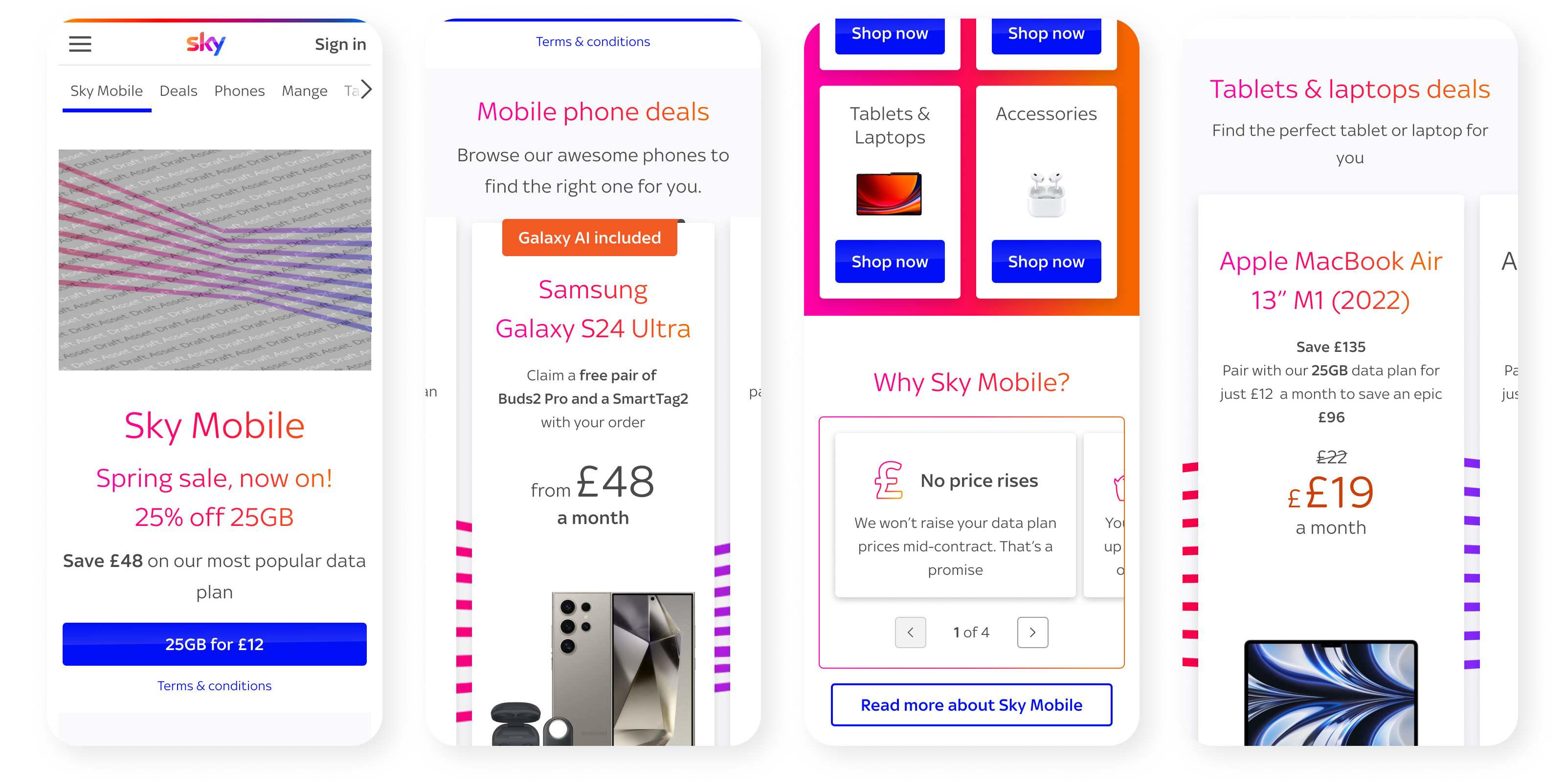
I designed the homepage as an intentional sequence: orient, choose a path, reassure and support decision-making:
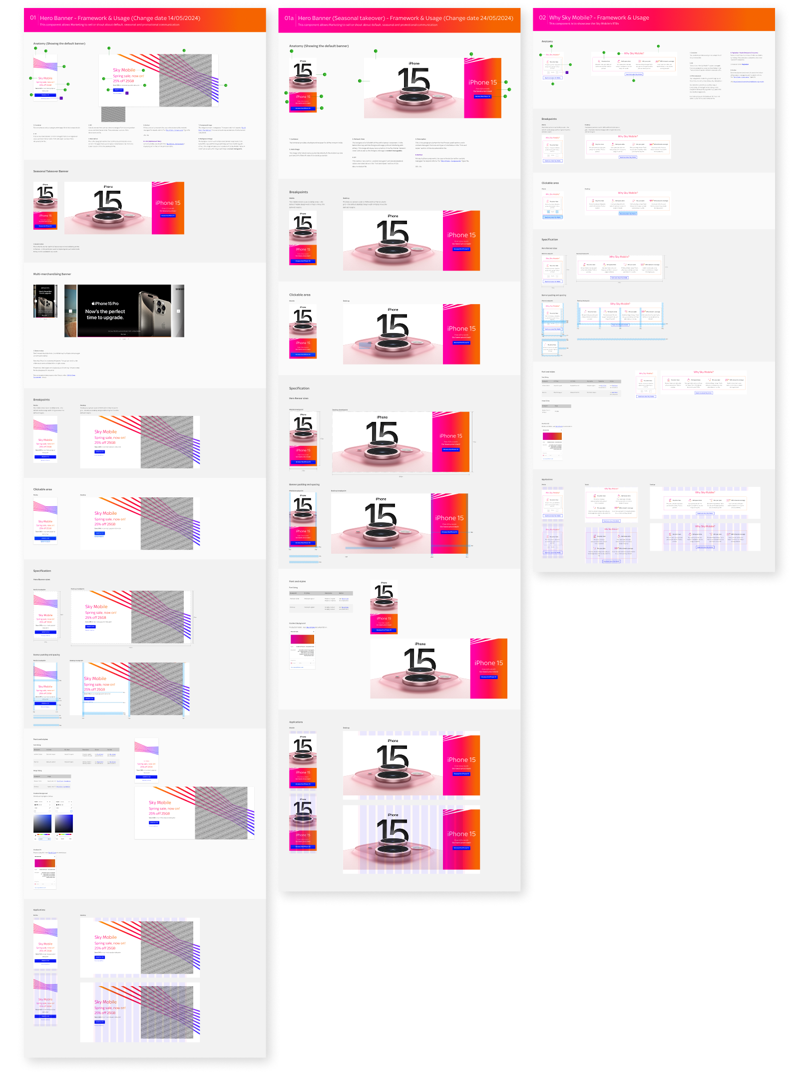
- Hero banner with three variants so the page can flex with trading needs (business as usual, seasonal launches and brand spotlights)
- Phone Deals as a clear commercial driver, designed to support agreements without swallowing the whole page
- Launch Pad as the simplest decision on the page: where do you want to go next?
- Phones
- SIM only
- Tablets and laptops
- Accessories
- Why Sky Mobile? and More reasons to choose Sky Mobile to bring key USPs out of hidden areas of the site
- Stay connected with Sky for utility and reassurance (login, My Sky app and coverage checker)
- FAQs expanded intentionally to reduce uncertainty and support SEO
Along the way I then tightened interaction detail and accessibility:
Cards became fully clickable for better target size and faster scanning
Built for keyboard navigation and screen reader compatibility
Clean hierarchy that supports quick scanning on mobile
Documentation
I documented patterns so the homepage wasn’t a one-off:
- Reusable card and merchandising rules across breakpoints
- Accessibility expectations embedded alongside patterns
- Content principles for RTBs and reassurance messaging
Test & validate .
After launch (13 Aug 2024), we validated the new homepage with a 50/50 traffic split between variant and control (13 Aug – 2 Sep 2024). In particular we measured conversion uplift and drop-off reduction to confirm improved orientation and navigation.
The results clearly showed the storefront improved performance:
- Overall conversion uplift: +6.7% (6.51% variant vs 6.1% control)
- Phones conversion uplift: +13.8% (4.54% variant vs 3.99% control)
- Drop-off rate: -12.51%
A strong storefront means people arrive at the PLP with more intent and more confidence. That matters because the next stage is where the June 2024 playback exposed the real pain: customers trying to evaluate value while bouncing between PLP, PDP and data plans.
Testing
- Moderated testing
- Heat maps
- Click through rate
Validating
- Validated via a 50/50 A/B test post-launch
- Measured conversion uplift and drop-off reduction to confirm improved orientation and navigation
Results
6.7%

6.51% (Variant) vs. 6.1% (Control)
13.8%

4.54% (Variant) vs. 3.99% (Control)
12.51%


