Unified Portal Strategy .
I led the strategy and design of a unified B2B SaaS portal for SITA, bringing together twelve fragmented businesses into one scalable platform with a single login, clearer service access and stronger data visibility.
Core business objective: reduce friction across SITA’s fragmented product estate, create one coherent customer entry point and establish a scalable platform that could support future services and stronger cross-business collaboration.
Collaborators: CEO, Managing Directors, Head of Design, product teams, Zensar engineering and the SITA in-house design team (that I helped create).
The problem .
SITA’s digital ecosystem had grown across twelve separate businesses, each with its own database, login and customer journey. For users, that meant fragmentation, repeated authentication and an inconsistent experience across services. For the business, it created duplication, operational complexity and limited visibility across the wider platform.
The challenge was not simply to redesign a few journeys. It was to unify an entire product estate without losing the depth or flexibility each business needed.
User needs
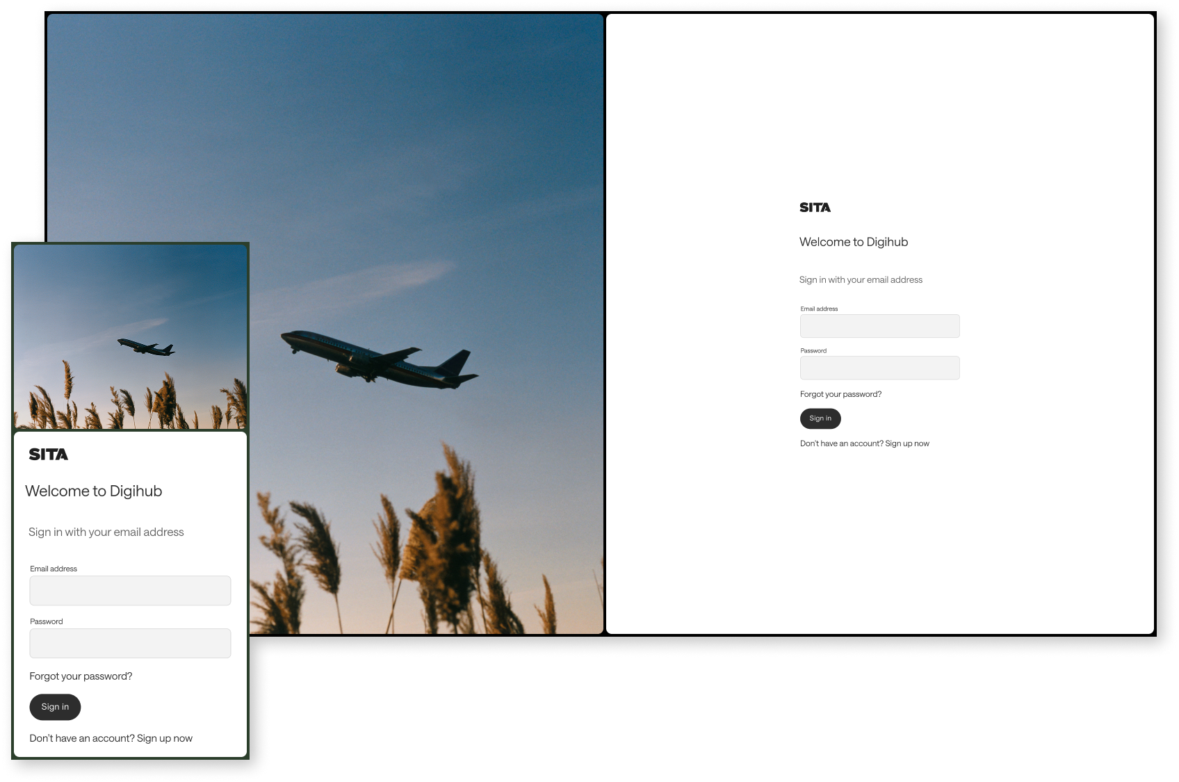
- One secure login across services
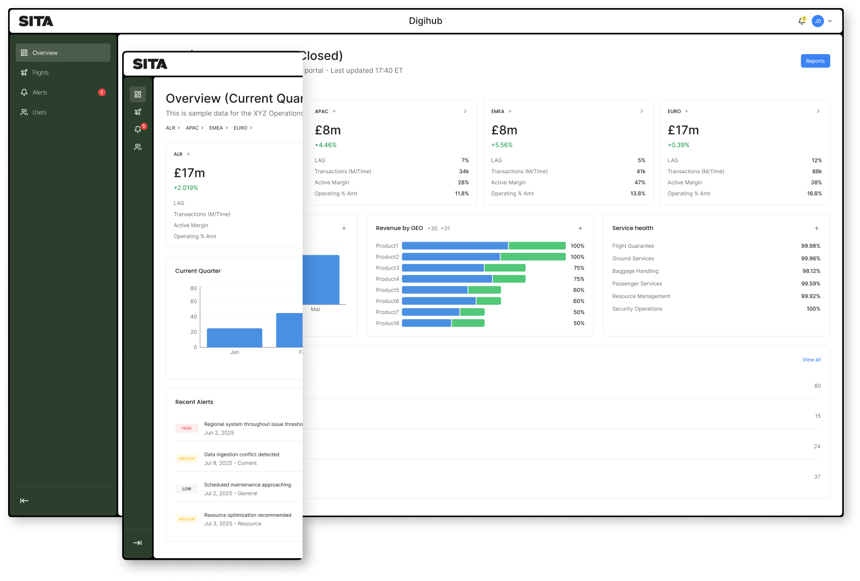
- Clearer navigation between products and accounts
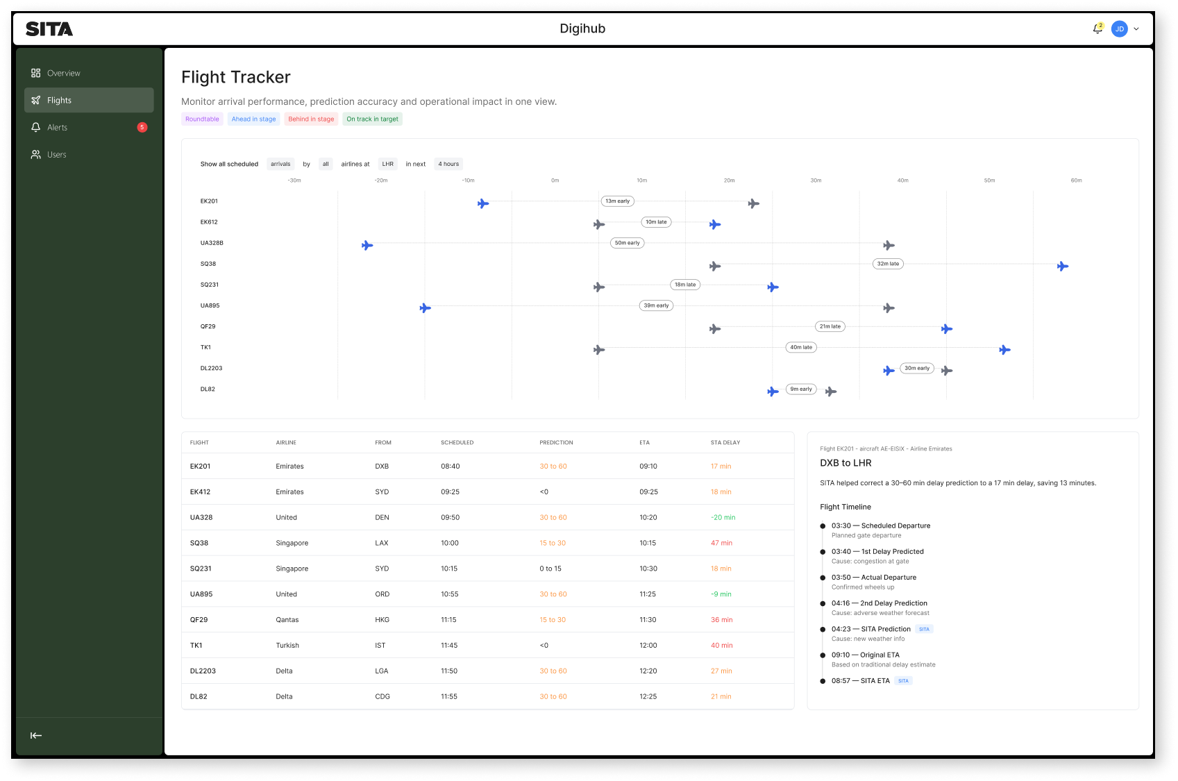
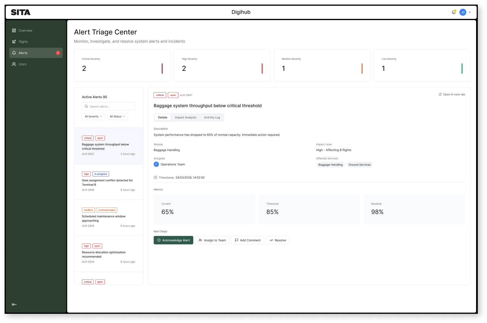
- Better visibility of service and performance data
- Less friction across key operational tasks
Business needs
- A single scalable portal strategy across twelve businesses
- Reduced duplication across teams and systems
- A stronger foundation for future services
- Better alignment between design, product and engineering
Problem statement
SITA needed to move from a fragmented set of disconnected customer experiences to one coherent B2B platform that could scale across business units without compromising usability or flexibility.
Defining success early .
Before designing the portal, I made success explicit. With this level of organisational complexity, teams can easily default to local priorities. I needed a shared definition of success that leaders and delivery teams could align around.
For this project, success meant simplifying access for customers, creating a platform that could scale across businesses and proving that design could lead a transformation at both product and organisational level.
What success looks like
- Customers should experience SITA through one coherent portal, not twelve disconnected systems
- The platform should reduce friction while still supporting complex business needs
- Teams should have a reusable foundation they can build on over time
- The solution should be flexible enough for in-house teams to extend without breaking consistency
This gave us a clear framework for decision-making as the work moved from strategy into delivery.
The research .
Discovery
I started by understanding the shape of the fragmentation. Each business unit had its own requirements, stakeholders and underlying data structure, so the first task was to map where the overlaps were, where the journeys diverged and where the current experience was failing customers
I worked closely with senior stakeholders across SITA, including the CEO, Managing Directors, Head of Design and product teams, to align on both the immediate pain points and the bigger opportunity. This was as much about organisational listening as it was about UX discovery.
User Pain Points
- Multiple logins and disconnected journeys
- Low visibility across accounts, services and performance data
- Inconsistent navigation and interaction patterns
- Fragmented ownership across business units
Acceptance Criteria
- One secure portal with one account structure
- Clear and consistent journeys across services
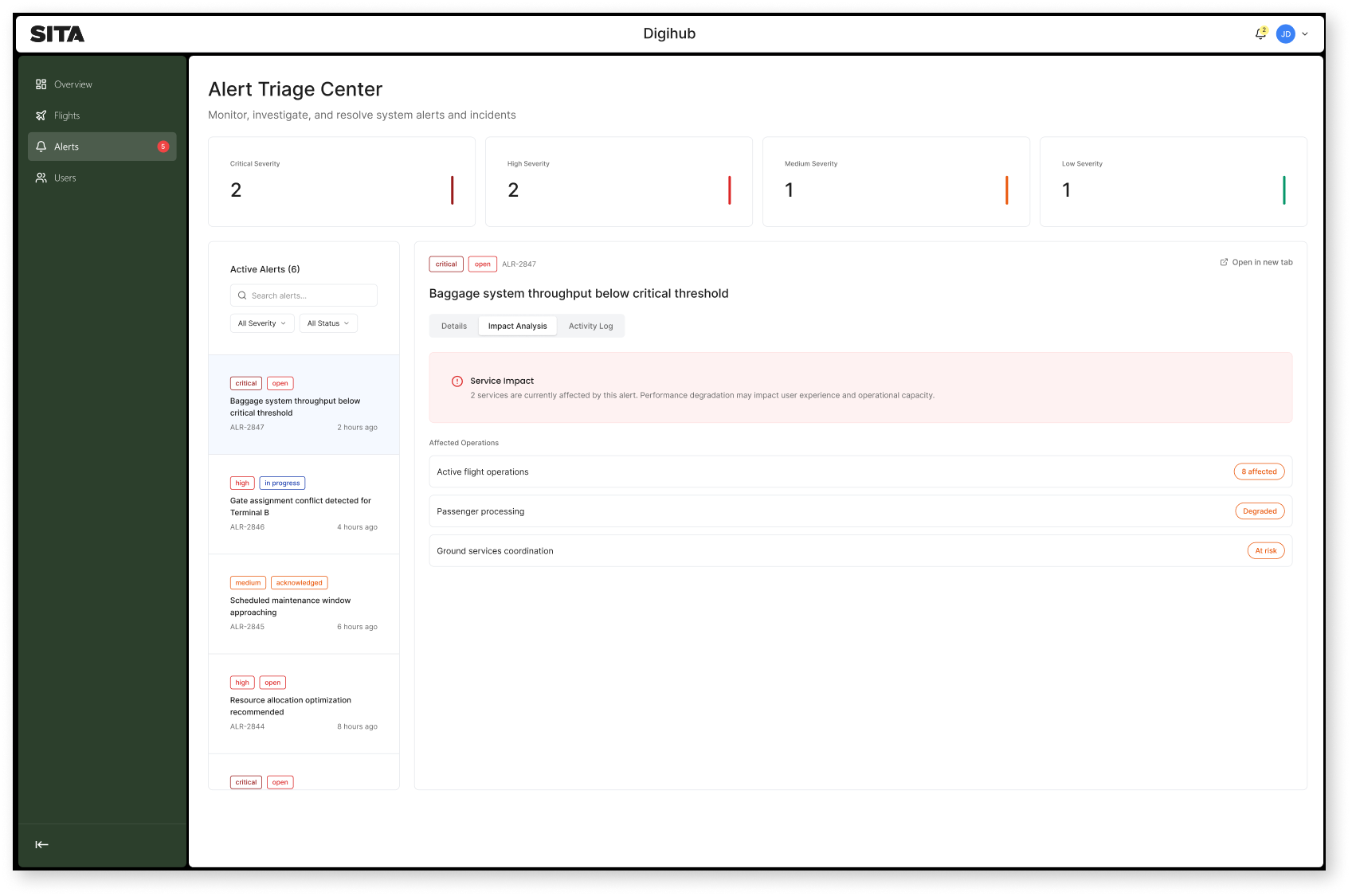
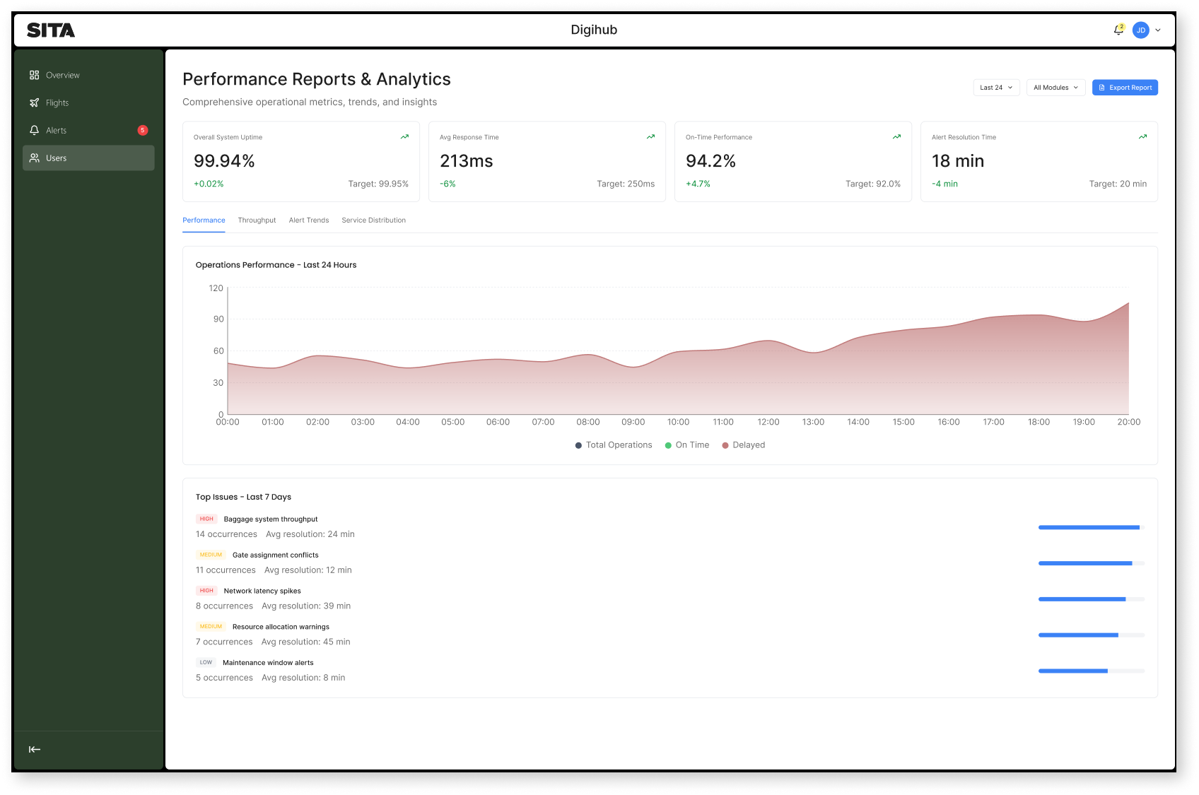
- Better at-a-glance data visibility with deeper drill-down where needed
- A design system that enables consistency and future growth
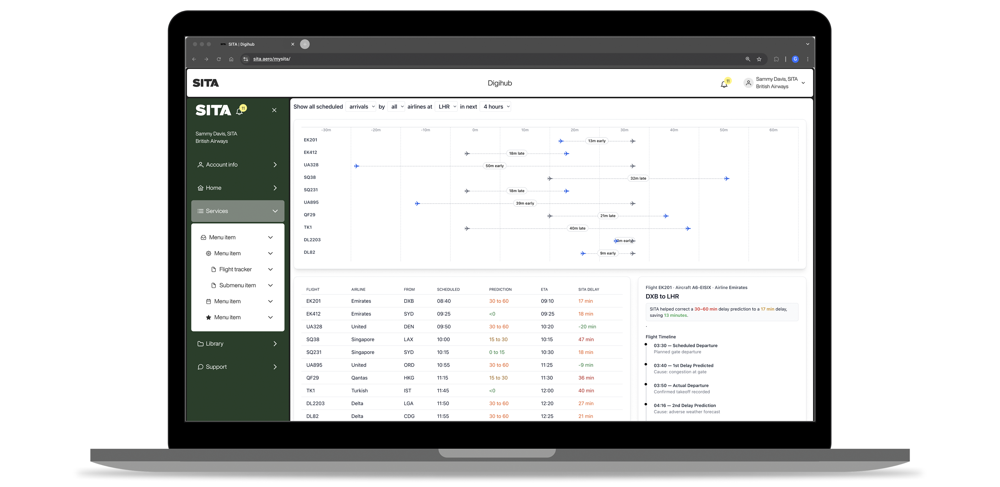
One of the clearest findings from the research was that SITA’s services were used almost exclusively in desktop-based work environments. Users were not engaging with these tools on the go. They were using them at work, during operational hours, to manage complex tasks and make informed decisions.
That gave me a clear direction early on. I chose to focus the experience on desktop, designing the platform to better support the real needs of business operators, executives and customer service teams. This allowed me to optimise for workload, clarity and deeper data interaction rather than spreading the experience across contexts that were not meaningful for users.
How Might We (HMW)
How might we create one secure entry point across twelve businesses without oversimplifying their individual needs?
HMW design dashboards that make complex operational data clear and useful at a glance?
HMW create a design system that supports consistency without constraining future teams?
Development .
I led the redesign through a strategic and multi-disciplinary approach, setting the design vision and principles while guiding the wider team through ambiguity and tight release cycles. The focus was not only on improving the UI, but on reshaping the structure of the page so the experience could work harder across product, content, engineering and commercial needs.
Refinement through iteration
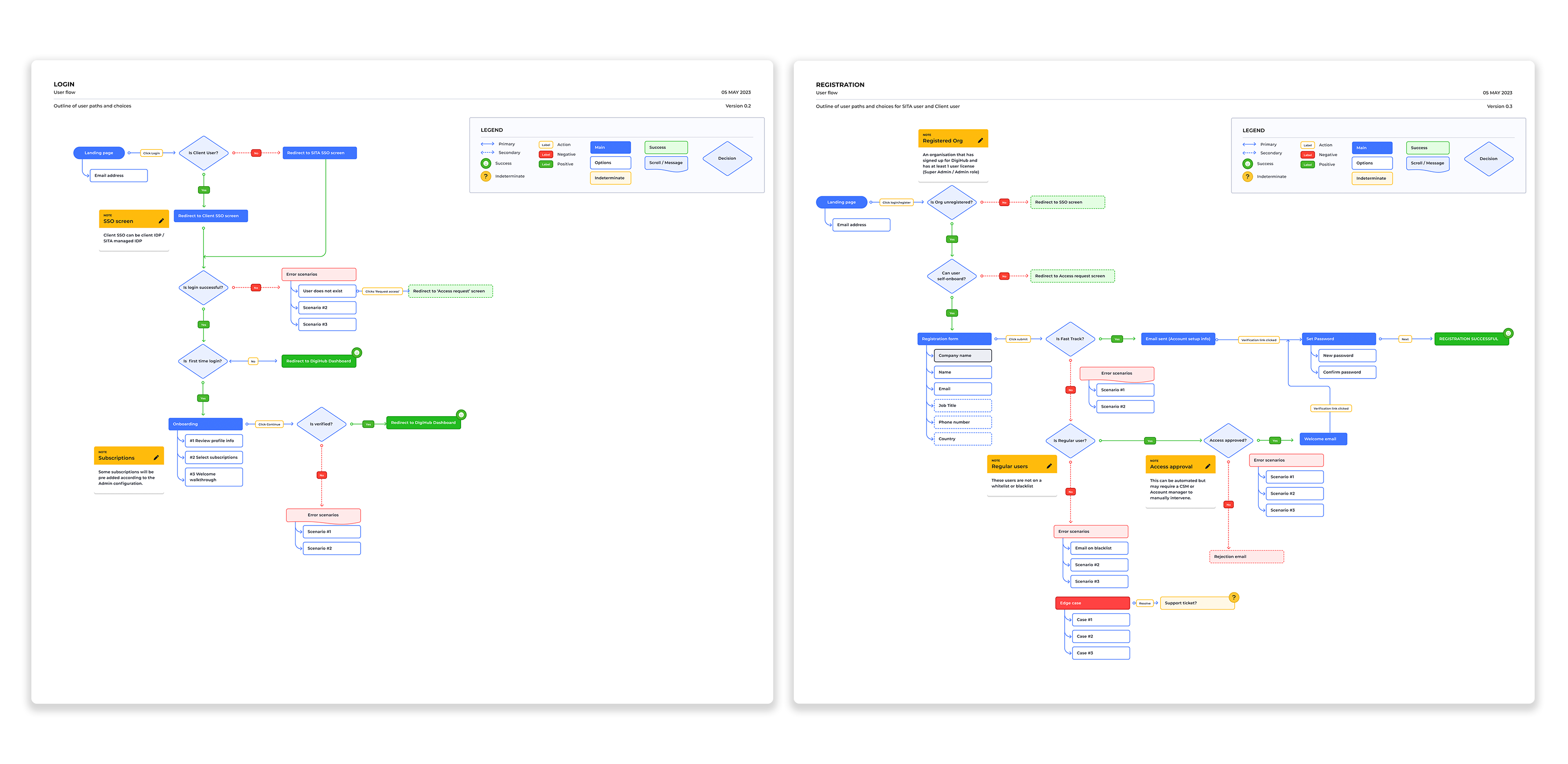
With the strategy aligned, I led the UX and UI design of the portal experience. Working with Zensar’s engineering team, I mapped the core journeys from authentication through to dashboards, account management and service access.
The key challenge was to make the experience feel clear and unified for customers while handling a high level of complexity behind the scenes. I treated this as a platform design problem rather than a collection of individual screens.
That meant constantly balancing simplicity and depth: what users needed immediately, what could be progressively disclosed and how data should be surfaced so it supported decision-making rather than adding noise.
Documentation
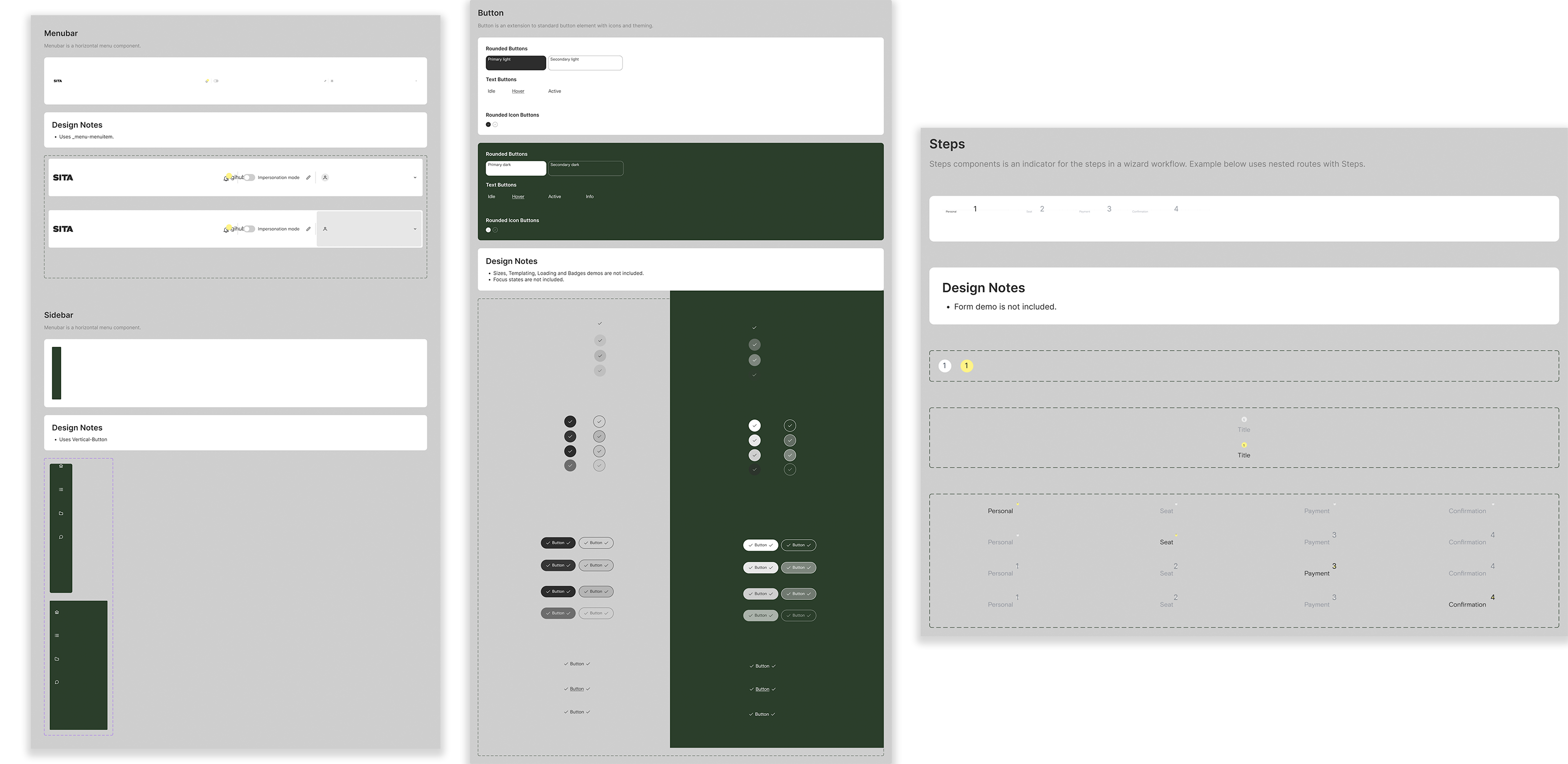
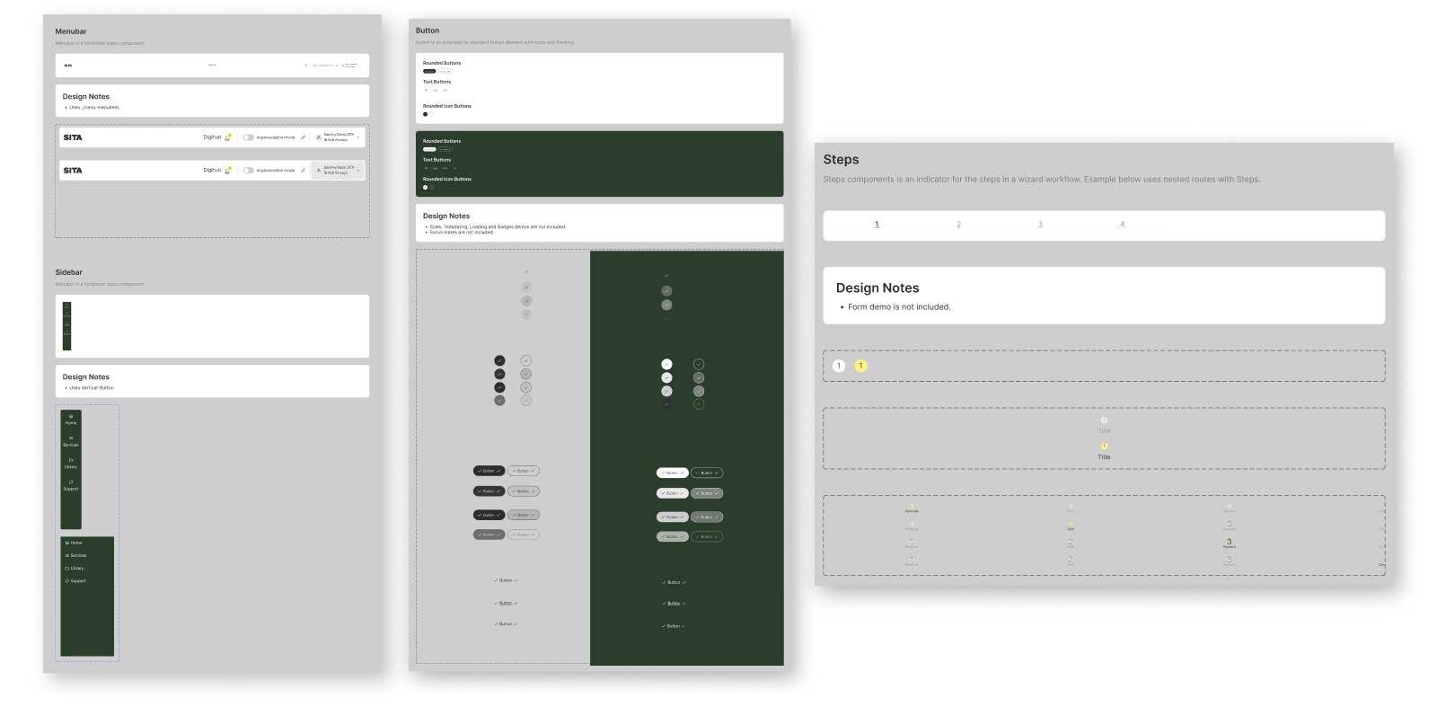
Alongside the product work, I created a flexible design system to support the portal. It established shared UI rules, reusable components and a clearer visual language across the experience.
Importantly, I did not want the system to become restrictive. It needed to bring consistency whilst leaving room for SITA’s in-house team to adapt, extend and grow the work over time. That flexibility made the system useful not just for launch, but for the platform’s longer-term evolution.
Test & validate .
Because this was a transformation programme involving multiple business units, validation was not only about interface quality. It was also about alignment, feasibility and confidence.
I used stakeholder reviews, journey mapping and iterative design discussions to keep the work grounded in real business and user needs. Close collaboration with engineering ensured the proposed experience could be delivered in a scalable way, while ongoing engagement with design and product helped maintain consistency as the portal took shape.
Impact and why it matters .
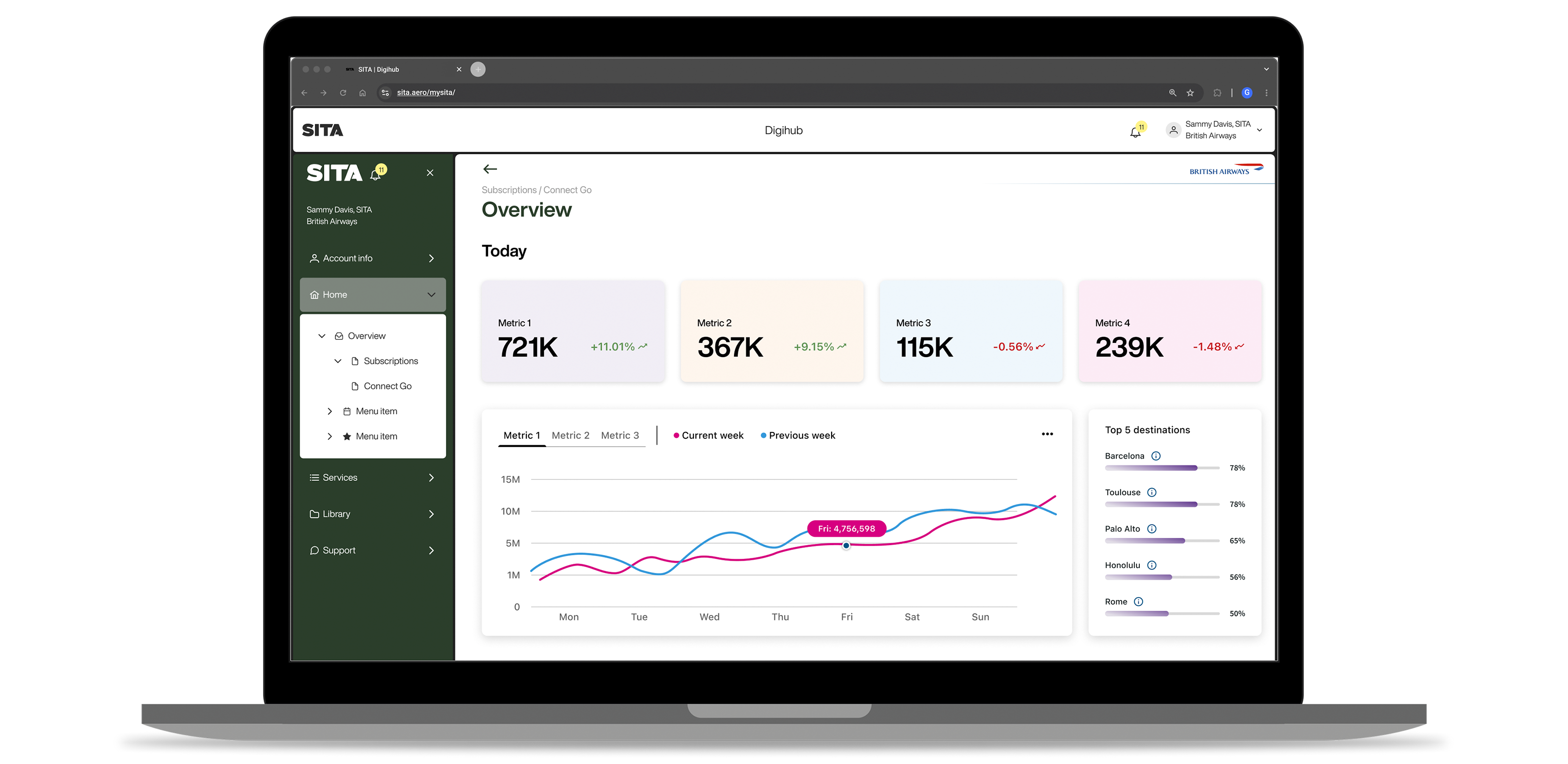
The first version of the unified portal launched within six months, giving SITA customers a single, more intuitive entry point into services that had previously been fragmented across the organisation.
The impact went beyond usability. The work created a scalable product foundation, improved visibility of data across key journeys and helped align teams around a shared direction. It also demonstrated the strategic value of design leadership in a complex B2B environment, where success depends as much on influence and alignment as on interface craft.
What I learned
The biggest lesson was that platform work at this scale depends on trust. A unified experience cannot be imposed by screens alone. It requires a clear vision, strong stakeholder relationships and a design system that teams want to use because it helps them move faster and with more confidence.
What's next
The initial release created the foundation for future growth. The portal can evolve further through deeper analytics, more contextual support and increasingly personalised dashboards, while the design system provides the structure needed to scale without losing coherence.


